Intelligent CSS Components
Accessible
Skin leverages semantic HTML, SVG, ARIA roles, states and properties to apply our styles wherever possible, thus enforcing correct, accessible markup.
Adaptive
A device with screen width of 600px or below is considered to be a small screen; over 600px is considered a large screen. Skin supports these sizes in an adaptive manner.
Declarative
Skin follows the BEM methadology of "Block, Element and Modifier" to ensure our HTML class name and structure is human readable and understandable.
Decoupled
Skin is decoupled from the JavaScript layer, meaning that HTML and CSS should not need to be reimplemented when the JS frontend framework changes.
Evergreen
As the eBay design system evolves, so too does Skin, meaning apps only need to keep their Skin package updated to ensure the latest look and feel.
Open
Skin operates under an open source model. GitHub allows any developer to contribute bug fixes, features, suggestions and ideas. Join the community and get involved!
Install
As of v3, Skin is distributed as the @ebay/skin package on the public NPM repository.
The package can be installed to the node_modules folder of your working directory by using the npm install command:
npm install @ebay/skin
Or alternatively by adding the package as a dependency in your package.json file:
{
    "dependencies": {
      "@ebay/skin": "^6"
    }
}
Lasso
Skin is optimised for use with Lasso.js.
Include the @ebay/skin package in your browser.json to include the entire set of Skin modules:
{
    "dependencies": [
        "@ebay/skin"
    ]
}
Or alternatively by specifying modules on a per-need basis:
{
    "dependencies": [
        "@ebay/skin/core",
        "@ebay/skin/button",
        "@ebay/skin/iconfont",
        "@ebay/skin/grid",
        "@ebay/skin/less"
    ]
}
Skin provides the following modules:
- @ebay/skin/actionable
- @ebay/skin/button
- @ebay/skin/card
- @ebay/skin/checkbox
- @ebay/skin/combo
- @ebay/skin/core
- @ebay/skin/dialog
- @ebay/skin/field
- @ebay/skin/form
- @ebay/skin/global
- @ebay/skin/grid
- @ebay/skin/iconfont
- @ebay/skin/icon
- @ebay/skin/less*
- @ebay/skin/listbox
- @ebay/skin/marketsans
- @ebay/skin/menu
- @ebay/skin/pagination
- @ebay/skin/radio
- @ebay/skin/spinner
- @ebay/skin/svg
- @ebay/skin/switch
- @ebay/skin/tab
- @ebay/skin/textbox
- @ebay/skin/utility
* The @ebay/skin/less module requires the additional lasso-less plugin in your app's package.json dependencies.
Bundles
Bundles are special Lasso.js modules that bundle together a collection of related Skin components.
Core
The @ebay/skin/core module bundles together Skin's core dependencies.
- @ebay/skin/global
- @ebay/skin/utility
Combo
The @ebay/skin/combo module bundles together Skin's most common modules, as identified across key eBay experiences.
- @ebay/skin/core
- @ebay/skin/dialog
- @ebay/skin/form
- @ebay/skin/icon
- @ebay/skin/iconfont
- @ebay/skin/spinner
Note: The combo bundle itself contains two other bundles. Lasso will take care of de-duping modules where necessary.
Form
The @ebay/skin/form module bundles together all form controls and field layout.
- @ebay/skin/button
- @ebay/skin/checkbox
- @ebay/skin/field
- @ebay/skin/listbox
- @ebay/skin/radio
- @ebay/skin/switch
- @ebay/skin/textbox
Adapters
Skin takes advantage of conditional dependencies in Lasso.js, to provide adaptive CSS for every component.
NOTE: Skin itself does not do any detection of browser size or capabilities, therefore it is the responsibility of the application logic (typically via device detection service) to detect which adapters are needed.
Skin Large
Skin is built for small screens first (7" and below). Styles for larger screens (i.e. desktop) are not supplied by default.
To meet the conditional dependency for large screen styles, Lasso.js requires the skin-large flag.
Skin DS
Skin has the capability to switch between previous, current and upcoming design systems at a component level.
To opt into the upcoming design system (DS6), Lasso.js requires the skin-ds6 flag. Please note that not all modules are available in DS6 yet.
IMPORTANT: There are some differences between design system versions, in terms of HTML structure and class names, so be sure to reference the appropriate documentation. In general we try to minimise these differences, but in some cases it cannot be avoided.
CDN
A CSS file containing the full collection of modules (except grid) for small screens is available via the following url:
https://ir.ebaystatic.com/cr/v/c1/skin/v6.1.0/ds4/skin.min.css
A small CSS file containing only the additional rules for large screens, for an adaptive approach, is also available:
https://ir.ebaystatic.com/cr/v/c1/skin/v6.1.0/ds4/skin-large.min.css
Finally, a CSS file containing all rules (with the large rules contained in a media query) is available at:
https://ir.ebaystatic.com/cr/v/c1/skin/v6.1.0/ds4/skin-full.min.css
Using this "full" file effectively means that your site is opting into a responsive approach rather than adaptive.
Fonts
Icon Font
Skin provides it's own custom icon-font via the @ebay/skin/iconfont module.
This module alone only downloads and installs the icon font-face from the eBay CDN. The individual icons within the font must be leveraged via classes provided by the icon module or via mixins provided by the less module.
NOTE: Although icon fonts are supported across all modern browsers, they sometimes experience "weird failures". Please refer to CSS tricks, which summarizes failure scenarios and other issues. It is because of such issues that Skin is currently transitioning over to an SVG based icon system.
Market Sans
Market Sans is a new and exclusive typeface developed specifically for eBay. This module downloads and installs the typeface directly from the eBay CDN servers. The typeface can then be referenced via the 'Market Sans' font-family name.
abcdefghijklmnopqrstuvwxyz
<style>
    p {
        font-family:  'Market Sans', 'Helvetica Neue', Helvetica, Arial, Roboto, sans-serif;
    }
</style>
TIP: The Market Sans font-family, and all fallbacks, can also be applied using the Less variable @font-family-market-sans.
Actionable
Actionable Icon
Use the icon-btn class (for buttons) or the icon-link class (for links) and any of the available SVG icons for a borderless, actionable icon style. Font-icons are no longer supported.
<button aria-label="Menu" class="icon-btn" type="button">
    <svg aria-hidden="true" focusable="false" width="16" height="16">
        <use xlink:href="#icon-menu"></use>
    </svg>
</button>
<a aria-label="Settings" class="icon-link" href="http://www.ebay.com">
    <svg aria-hidden="true" focusable="false" width="16" height="16">
        <use xlink:href="#icon-settings"></use>
    </svg>
</a>
Actionable Image
Use the img-btn class (for buttons) or the img-link class (for links) to create an actionable image-tile effect on hover, focus and active states.

<button type="button" class="img-btn">
    <img src="http://i2.ebayimg.com/images/g/e0oAAOSwsN9W~YBY/s-l200.jpg" alt="iPhone" />
</button>
<a href="http://www.ebay.com/sch/i.html?_nkw=iphone" class="img-link">
    <img src="http://i2.ebayimg.com/images/g/e0oAAOSwsN9W~YBY/s-l200.jpg" alt="iPhone" />
</a>
@ebay/skin/badge
A badge is a visual indicator added to an element to convey quantity, newness or both. Badges are intended to remind a user of previous actions taken, or to alert them of new actions that they should consider.
Default Badge
The default badge contains the basic, base styles. A role and aria-label are added for assistive technology.
<span class="badge" role="img" aria-label="1 notification">1</span>
Menu Badge
A badge can be placed inside of a menu item and it will receive the appropriate margin. Note that the aria-label is now moved to the menuitem role.
<span class="menu">
    <div class="menu__items" role="menu">
        <div aria-label="Item 1 (3 notifications)" class="menu__item" role="menuitem">
            <span aria-hidden="true">Item 1<span class="badge">3</span></span>
        </div>
        <div aria-label="Item 2 (77 notifications)" class="menu__item" role="menuitem">
            <span aria-hidden="true">Item 2<span class="badge">77</span></span>
        </div>
        <div class="menu__item" role="menuitem">
            <span>Item 3</span>
        </div>
    </div>
</span>
Icon Button Badge
A badge can be placed inside of an icon button and it will receive the appropriate positioning. Note that the aria-label is now moved to the button role.
The button element requires an additional icon-btn--badged modifier.
<button aria-label="Menu (4 notifications)" class="icon-btn icon-btn--badged" type="button">
    <svg aria-hidden="true" focusable="false" width="16" height="16">
        <use xlink:href="#icon-menu"></use>
    </svg>
    <span aria-hidden="true" class="badge">4</span>
</button>
Card
A card forms the content layer in the eBay Design System topography of background layer, content layer & content. This system requires that the background layer (typically the HTML body tag) have zero margin and padding. The card content layer is responsible for creating all necessary margin & padding.
There are three types of card: regular card, primary card & full-page card.
All cards use a nested card__cell element to denote the inner content of the card block. Any content placed outside of this cell will be full-bleed (i.e. edge to edge). See hero card section below for more information.
NOTE: in all card examples below we use a fixed-height div to simulate Skin's default grey background layer.
Regular Card
Use the card class to create a card with vertical and horizontal margins.
This 'floating' effect helps differentiate data sets and is used to identify secondary, tertiary & extraneous content.
Title
Heading
Lorem ipsum dolor sit amet, consectetur adipiscing elit. Vivamus convallis molestie erat, ut adipiscing risus blandit vel. Vivamus luctus elementum lorem, eu sodales velit sagittis id. Donec a est ligula, eget volutpat augue.
Heading
Lorem ipsum dolor sit amet, consectetur adipiscing elit. Vivamus convallis molestie erat, ut adipiscing risus blandit vel. Vivamus luctus elementum lorem, eu sodales velit sagittis id. Donec a est ligula, eget volutpat augue.
<div class="card">
    <div class="card__cell">
        <h2>Title</h2>
        <h3>Heading</h3>
        <p>Lorem ipsum dolor sit amet, consectetur adipiscing elit. Vivamus convallis molestie erat, ut adipiscing risus blandit vel. Vivamus luctus elementum lorem, eu sodales velit sagittis id. Donec a est ligula, eget volutpat augue.</p>
        <h3>Heading</h3>
        <p>Lorem ipsum dolor sit amet, consectetur adipiscing elit. Vivamus convallis molestie erat, ut adipiscing risus blandit vel. Vivamus luctus elementum lorem, eu sodales velit sagittis id. Donec a est ligula, eget volutpat augue.</p>
    </div>
</div>
Primary Card
Use the card--primary modifier to create a primary, full-width card.
Only one primary card should be deployed per page. It is used to identify primary content and spans the entire width of the background layer.
Title
Heading
Lorem ipsum dolor sit amet, consectetur adipiscing elit. Vivamus convallis molestie erat, ut adipiscing risus blandit vel. Vivamus luctus elementum lorem, eu sodales velit sagittis id. Donec a est ligula, eget volutpat augue.
Heading
Lorem ipsum dolor sit amet, consectetur adipiscing elit. Vivamus convallis molestie erat, ut adipiscing risus blandit vel. Vivamus luctus elementum lorem, eu sodales velit sagittis id. Donec a est ligula, eget volutpat augue.
<div class="card card--primary">
    <div class="card__cell">
        <h2>Title</h2>
        <h3>Heading</h3>
        <p>Lorem ipsum dolor sit amet, consectetur adipiscing elit. Vivamus convallis molestie erat, ut adipiscing risus blandit vel. Vivamus luctus elementum lorem, eu sodales velit sagittis id. Donec a est ligula, eget volutpat augue.</p>
        <h3>Heading</h3>
        <p>Lorem ipsum dolor sit amet, consectetur adipiscing elit. Vivamus convallis molestie erat, ut adipiscing risus blandit vel. Vivamus luctus elementum lorem, eu sodales velit sagittis id. Donec a est ligula, eget volutpat augue.</p>
    </div>
</div>
Full Page Card
Applying the card class directly to the body tag creates a full page card. Full page cards span the full width and height of the page.
Title
Heading
Lorem ipsum dolor sit amet, consectetur adipiscing elit. Vivamus convallis molestie erat, ut adipiscing risus blandit vel. Vivamus luctus elementum lorem, eu sodales velit sagittis id. Donec a est ligula, eget volutpat augue.
Heading
Lorem ipsum dolor sit amet, consectetur adipiscing elit. Vivamus convallis molestie erat, ut adipiscing risus blandit vel. Vivamus luctus elementum lorem, eu sodales velit sagittis id. Donec a est ligula, eget volutpat augue.
<body class="card">
    <div class="card__cell">
        <h1>Title</h1>
        <div>
            <h2>Heading</h2>
            <p>Lorem ipsum dolor sit amet, consectetur adipiscing elit. Vivamus convallis molestie erat, ut adipiscing risus blandit vel. Vivamus luctus elementum lorem, eu sodales velit sagittis id. Donec a est ligula, eget volutpat augue.</p>
        </div>
    </div>
</div>
Hero Card
For cards with large hero headers, apply the card--hero modifier. The hero element must immediately precede the card__cell element.
TIP: A CSS background image can also be used as the hero image.

Title
Lorem ipsum dolor sit amet, consectetur adipiscing elit. Vivamus convallis molestie erat, ut adipiscing risus blandit vel. Vivamus luctus elementum lorem, eu sodales velit sagittis id. Donec a est ligula, eget volutpat augue.
Title
Lorem ipsum dolor sit amet, consectetur adipiscing elit. Vivamus convallis molestie erat, ut adipiscing risus blandit vel. Vivamus luctus elementum lorem, eu sodales velit sagittis id. Donec a est ligula, eget volutpat augue.
<div class="card card--primary card--hero">
    <img alt="" class="responsive-image" src="http://i.ebayimg.com/00/s/OTI0WDE1MzY=/z/H4gAAOSwJQdXBsto/$_57.JPG?set_id=80000000000" />
    <div class="card__cell">
        <h2>Title</h2>
        <p>Lorem ipsum dolor sit amet, consectetur adipiscing elit. Vivamus convallis molestie erat, ut adipiscing risus blandit vel. Vivamus luctus elementum lorem, eu sodales velit sagittis id. Donec a est ligula, eget volutpat augue.</p>
    </div>
</div>
<div class="card">
    <div class="card__cell">
        <h2>Title</h2>
        <p>Lorem ipsum dolor sit amet, consectetur adipiscing elit. Vivamus convallis molestie erat, ut adipiscing risus blandit vel. Vivamus luctus elementum lorem, eu sodales velit sagittis id. Donec a est ligula, eget volutpat augue.</p>
    </div>
</div>
Dialog Cards
Cards can also be used inside of any dialog.
Dialog with Cards
Title
Heading
Lorem ipsum dolor sit amet, consectetur adipiscing elit. Vivamus convallis molestie erat, ut adipiscing risus blandit vel. Vivamus luctus elementum lorem, eu sodales velit sagittis id. Donec a est ligula, eget volutpat augue.
Heading
Lorem ipsum dolor sit amet, consectetur adipiscing elit. Vivamus convallis molestie erat, ut adipiscing risus blandit vel. Vivamus luctus elementum lorem, eu sodales velit sagittis id. Donec a est ligula, eget volutpat augue.
Heading
Lorem ipsum dolor sit amet, consectetur adipiscing elit. Vivamus convallis molestie erat, ut adipiscing risus blandit vel. Vivamus luctus elementum lorem, eu sodales velit sagittis id. Donec a est ligula, eget volutpat augue.
Heading
Lorem ipsum dolor sit amet, consectetur adipiscing elit. Vivamus convallis molestie erat, ut adipiscing risus blandit vel. Vivamus luctus elementum lorem, eu sodales velit sagittis id. Donec a est ligula, eget volutpat augue.
<div role="dialog" class="dialog" id="dialog-card" aria-labelledby="dialog-card-title" hidden>
    <div class="dialog__window" role="document">
        <header class="dialog__header">
            <h2 class="dialog__title" id="dialog-card-title">Dialog with Cards</h2>
            <button class="dialog__close" aria-label="Close dialog" type="button">
                <svg aria-hidden="true" focusable="false">
                    <use xlink:href="#icon-close"></use>
                </svg>
            </button>
        </header>
        <div class="dialog__body">
            <div class="card card--primary">
                <div class="card__cell">
                    <!-- card content -->
                </div>
            </div>
            <div class="card">
                <div class="card__cell">
                    <!-- card content -->
            </div>
        </div>
    </div>
    <div class="dialog__mask"></div>
</div>
To create a full content layer inside of a dialog, apply the dialog--card modifier to the dialog block.
@ebay/skin/checkbox
A checkbox is a form control that allows the user to toggle a choice on or off.
The purpose of a checkbox is to collect form data; therefore a checkbox should always be used in conjunction with a form, label and submit button.
Default Checkbox
Use the checkbox base class to create a checkbox.
The checkbox is decoupled from it's text label to allow more flexibility in terms of layout. How and where you provide this label is up to you, but do not forget it!
<span class="checkbox">
    <input class="checkbox__control" type="checkbox" name="checkbox-default" />
    <span class="checkbox__icon"></span>
</span>
Disabled Checkbox
Use the disabled attribute to disable any checkbox input.
<span class="checkbox">
    <input class="checkbox__control" type="checkbox" name="checkbox-disabled" checked disabled  />
    <span class="checkbox__icon"></span>
</span>
Grouped Checkboxes
A group of checkboxes allows multi-select (unlike a group of radio buttons which enforces single-select).
A fieldset and legend are required in order to create the correct grouping semantics. Note that the Skin global module removes the default fieldset border and padding.
TIP: To stack checkboxes vertically instead of side-by-side, simply replace the span wrapper with a div wrapper.
<fieldset>
    <legend>Choose an Option</legend>
    <span class="field">
        <span class="checkbox field__control">
            <input class="checkbox__control" id="group-checkbox-1" type="checkbox" value="1" name="checkbox-group" />
            <span class="checkbox__icon"></span>
        </span>
        <label class="field__label field__label--end" for="group-checkbox-1">Option 1</label>
    </span>
    <span class="field">
        <span class="checkbox field__control">
            <input class="checkbox__control" id="group-checkbox-2" type="checkbox" value="2" name="checkbox-group" />
            <span class="checkbox__icon"></span>
        </span>
        <label class="field__label field__label--end" for="group-checkbox-2">Option 2</label>
    </span>
    <span class="field">
        <span class="checkbox field__control">
            <input class="checkbox__control" id="group-checkbox-3" type="checkbox" value="3" name="checkbox-group" />
            <span class="checkbox__icon"></span>
        </span>
        <label class="field__label field__label--end" for="group-checkbox-3">Option 3</label>
    </span>
</fieldset>
Custom Checkbox
The default checkbox shown above uses an SVG background image, and therefore has a fixed colour. Inline SVG, while slightly more verbose, honours the CSS cascade, thus allowing any possible colour for the checkbox icon.
<span class="checkbox" style="color: #5ba71b">
    <input class="checkbox__control" type="checkbox" />
    <span class="checkbox__icon" hidden>
        <svg aria-hidden="true" class="checkbox__unchecked" focusable="false">
            <use xlink:href="#icon-checkbox-unchecked"></use>
        </svg>
        <svg aria-hidden="true" class="checkbox__checked" focusable="false">
            <use xlink:href="#icon-checkbox-checked"></use>
        </svg>
    </span>
</span>
NOTE: The hidden property ensures that the SVG icon is not visible alongside the native icon when the page is in a non-CSS state. This hidden property will be overriden by CSS.
The checkbox module can use any inline SVG for it's checked and unchecked states.
<span class="checkbox">
    <input class="checkbox__control" name="checkbox-custom" type="checkbox" />
    <span class="checkbox__icon" hidden style="color: #5ba71b">
        <svg aria-hidden="true" class="checkbox__unchecked" focusable="false">
            <use xlink:href="#icon-checkbox-unchecked"></use>
        </svg>
        <svg aria-hidden="true" class="checkbox__checked" focusable="false">
            <use xlink:href="#icon-confirmation"></use>
        </svg>
    </span>
</span>
Be careful when using a custom checkbox; the icon for each state must still give enough affordance to a user that it represents an interactive control.
@ebay/skin/color
Static sites that do not have access to the LESS variables can leverage the product palette via the color module class names.
- color-text-default
- color-text-secondary
- color-link-default
- color-link-visited
- color-information-background
- color-warning-background
- color-critical-text
- color-critical-background
- color-confirmation-text
- color-confirmation-background
@ebay/skin/combobox
An enhanced textbox that allows free text input, or selection from a predefined list of values, or a combination of both. Hence the term 'combo'.
Only limited expand & collapse behaviour has been implemented in these combobox examples. For detailed behaviour requirements, please visit the eBay MIND Pattern for Combobox.
Default Combobox
By default, no option in the list should be selected.
<span class="combobox">
    <span class="combobox__control">
        <input placeholder="Combobox" role="combobox" type="text" aria-haspopup="listbox" aria-owns="listbox1" />
        <span class="combobox__icon" aria-hidden="true"></span>
    </span>
    <div id="listbox1" class="combobox__options" role="listbox">
        <div class="combobox__option" role="option">
            <span>Option 1</span>
            <span class="combobox__status"></span>
        </div>
        <div class="combobox__option" role="option">
            <span>Option 2</span>
            <span class="combobox__status"></span>
        </div>
        <div class="combobox__option" role="option">
            <span>Option 3</span>
            <span class="combobox__status"></span>
        </div>
    </div>
</span>
The combobox overlay becomes automatically scrollable at a height of 400px.
Disabled Combobox
Apply the disabled property to disable the combobox.
<span class="combobox">
    <span class="combobox__control">
        <input placeholder="Combobox" role="combobox" type="text" aria-haspopup="listbox" aria-owns="listbox2" disabled />
        <span class="combobox__icon" aria-hidden="true"></span>
    </span>
    <div id="listbox2" class="combobox__options" role="listbox">
        <div class="combobox__option" role="option">
            <span>Option 1</span>
            <span class="combobox__status"></span>
        </div>
        <div class="combobox__option" role="option">
            <span>Option 2</span>
            <span class="combobox__status"></span>
        </div>
        <div class="combobox__option" role="option">
            <span>Option 3</span>
            <span class="combobox__status"></span>
        </div>
    </div>
</span>
Readonly Combobox
A readonly combobox is intended for use as a custom implementation of the native HTML select element. Unfortunately, a readonly combobox exhibits some UX issues on iOS, which is why for now we recommend using the listbox instead.
Apply the readonly property to create a readonly combobox.
By default, the first item should be selected if the user does not specify a selection. This matches the behaviour of a native HTML select element.
<span class="combobox">
    <span class="combobox__control">
        <input role="combobox" type="text" value="Option 1" aria-haspopup="listbox" aria-owns="listbox4" readonly />
        <span class="combobox__icon" aria-hidden="true"></span>
    </span>
    <div id="listbox4" class="combobox__options" role="listbox">
        <div class="combobox__option" role="option" aria-selected="true">
            <span>Option 1</span>
            <span class="combobox__status"></span>
        </div>
        <div class="combobox__option" role="option">
            <span>Option 2</span>
            <span class="combobox__status"></span>
        </div>
        <div class="combobox__option" role="option">
            <span>Option 3</span>
            <span class="combobox__status"></span>
        </div>
    </div>
</span>
@ebay/skin/dialog
A dialog is a child window spawned by the main web page or application. This window forms a new background layer in our design system topography.
A dialog must remain in a hidden state for all users and devices until called upon.
All dialogs have support for optional CSS transition effects. See dialog transitions section for more details.
Default Dialog
The default dialog is a lightbox.
The lightbox will have a margin of 15vh and automatically scales vertically.
Heading
Lorem ipsum dolor sit amet, consectetur adipiscing elit, sed do eiusmod tempor incididunt ut labore et dolore magna aliqua. Ut enim ad minim veniam, quis nostrud exercitation ullamco laboris nisi ut aliquip ex ea commodo consequat. Duis aute irure dolor in reprehenderit in voluptate velit esse cillum dolore eu fugiat nulla pariatur. Excepteur sint occaecat cupidatat non proident, sunt in culpa qui officia deserunt mollit anim id est laborum.
<div role="dialog" aria-labelledby="dialog-title" class="dialog" hidden>
    <div class="dialog__window" role="document">
        <button aria-label="Close dialog" class="dialog__close" type="button">
            <span></span>
        </button>
        <div class="dialog__body">
            <h2 id="dialog-title" class="large-text-1 bold-text">Heading</h2>
            <p>Lorem ipsum dolor sit amet, consectetur adipiscing elit, sed do eiusmod tempor incididunt ut labore et dolore
                magna aliqua. Ut enim ad minim veniam, quis nostrud exercitation ullamco laboris nisi ut aliquip ex ea commodo
                consequat. Duis aute irure dolor in reprehenderit in voluptate velit esse cillum dolore eu fugiat nulla pariatur.
                Excepteur sint occaecat cupidatat non proident, sunt in culpa qui officia deserunt mollit anim id est laborum.</p>
            <p><a href="http://www.ebay.com">www.ebay.com</a></p>
        </div>
    </div>
</div>
Fill Dialog
Apply the dialog__window--fill modifier to have the lightbox fill at least 70% of the screen (centered vertically).
Heading
Lorem ipsum dolor sit amet, consectetur adipiscing elit, sed do eiusmod tempor incididunt ut labore et dolore magna aliqua. Ut enim ad minim veniam, quis nostrud exercitation ullamco laboris nisi ut aliquip ex ea commodo consequat. Duis aute irure dolor in reprehenderit in voluptate velit esse cillum dolore eu fugiat nulla pariatur. Excepteur sint occaecat cupidatat non proident, sunt in culpa qui officia deserunt mollit anim id est laborum.
<div role="dialog" aria-labelledby="dialog-title" class="dialog" hidden>
    <div class="dialog__window dialog__window--fill" role="document">
        <button aria-label="Close dialog" class="dialog__close" type="button">
            <span></span>
        </button>
        <div class="dialog__body">
            <h2 id="dialog-title" class="large-text-1 bold-text">Heading</h2>
            <p>Lorem ipsum dolor sit amet, consectetur adipiscing elit, sed do eiusmod tempor incididunt ut labore et dolore
                magna aliqua. Ut enim ad minim veniam, quis nostrud exercitation ullamco laboris nisi ut aliquip ex ea commodo
                consequat. Duis aute irure dolor in reprehenderit in voluptate velit esse cillum dolore eu fugiat nulla pariatur.
                Excepteur sint occaecat cupidatat non proident, sunt in culpa qui officia deserunt mollit anim id est laborum.</p>
            <p><a href="http://www.ebay.com">www.ebay.com</a></p>
        </div>
    </div>
</div>
Left Panel Dialog
Apply the dialog__window--left modifier to have the dialog act as a left side panel (100vh height and aligned to the left side of the screen).
Heading
Lorem ipsum dolor sit amet, consectetur adipiscing elit, sed do eiusmod tempor incididunt ut labore et dolore magna aliqua. Ut enim ad minim veniam, quis nostrud exercitation ullamco laboris nisi ut aliquip ex ea commodo consequat. Duis aute irure dolor in reprehenderit in voluptate velit esse cillum dolore eu fugiat nulla pariatur. Excepteur sint occaecat cupidatat non proident, sunt in culpa qui officia deserunt mollit anim id est laborum.
<div role="dialog" aria-labelledby="dialog-title" class="dialog" hidden>
    <div class="dialog__window dialog__window--left" role="document">
        <button aria-label="Close dialog" class="dialog__close" type="button">
            <span></span>
        </button>
        <div class="dialog__body">
            <h2 id="dialog-title" class="large-text-1 bold-text">Heading</h2>
            <p>Lorem ipsum dolor sit amet, consectetur adipiscing elit, sed do eiusmod tempor incididunt ut labore et dolore
                magna aliqua. Ut enim ad minim veniam, quis nostrud exercitation ullamco laboris nisi ut aliquip ex ea commodo
                consequat. Duis aute irure dolor in reprehenderit in voluptate velit esse cillum dolore eu fugiat nulla pariatur.
                Excepteur sint occaecat cupidatat non proident, sunt in culpa qui officia deserunt mollit anim id est laborum.</p>
            <p><a href="http://www.ebay.com">www.ebay.com</a></p>
        </div>
    </div>
</div>
Right Panel Dialog
Apply the dialog__window--right modifier to have the dialog act as a right side panel (100vh height and aligned to the right side of the screen).
Heading
Lorem ipsum dolor sit amet, consectetur adipiscing elit, sed do eiusmod tempor incididunt ut labore et dolore magna aliqua. Ut enim ad minim veniam, quis nostrud exercitation ullamco laboris nisi ut aliquip ex ea commodo consequat. Duis aute irure dolor in reprehenderit in voluptate velit esse cillum dolore eu fugiat nulla pariatur. Excepteur sint occaecat cupidatat non proident, sunt in culpa qui officia deserunt mollit anim id est laborum.
<div role="dialog" aria-labelledby="dialog-title" class="dialog" hidden>
    <div class="dialog__window dialog__window--right" role="document">
        <button aria-label="Close dialog" class="dialog__close" type="button">
            <span></span>
        </button>
        <div class="dialog__body">
            <h2 id="dialog-title" class="large-text-1 bold-text">Heading</h2>
            <p>Lorem ipsum dolor sit amet, consectetur adipiscing elit, sed do eiusmod tempor incididunt ut labore et dolore
                magna aliqua. Ut enim ad minim veniam, quis nostrud exercitation ullamco laboris nisi ut aliquip ex ea commodo
                consequat. Duis aute irure dolor in reprehenderit in voluptate velit esse cillum dolore eu fugiat nulla pariatur.
                Excepteur sint occaecat cupidatat non proident, sunt in culpa qui officia deserunt mollit anim id est laborum.</p>
            <p><a href="http://www.ebay.com">www.ebay.com</a></p>
        </div>
    </div>
</div>
Fullscreen Panel Dialog
Apply the dialog__window--full modifier to have the dialog take up the entire viewport.
Having a mask on a fullscreen dialog doesn't typically make sense and can cause the animations to look a bit strange. You can disable the default background mask of the dialog by applying the dialog--no-mask modifier on the dialog element.
Heading
Lorem ipsum dolor sit amet, consectetur adipiscing elit, sed do eiusmod tempor incididunt ut labore et dolore magna aliqua. Ut enim ad minim veniam, quis nostrud exercitation ullamco laboris nisi ut aliquip ex ea commodo consequat. Duis aute irure dolor in reprehenderit in voluptate velit esse cillum dolore eu fugiat nulla pariatur. Excepteur sint occaecat cupidatat non proident, sunt in culpa qui officia deserunt mollit anim id est laborum.
<div role="dialog" aria-labelledby="dialog-title" class="dialog dialog--no-mask" hidden>
    <div class="dialog__window dialog__window--full" role="document">
        <button aria-label="Close dialog" class="dialog__close" type="button">
            <span></span>
        </button>
        <div class="dialog__body">
            <h2 id="dialog-title" class="large-text-1 bold-text">Heading</h2>
            <p>Lorem ipsum dolor sit amet, consectetur adipiscing elit, sed do eiusmod tempor incididunt ut labore et dolore
                magna aliqua. Ut enim ad minim veniam, quis nostrud exercitation ullamco laboris nisi ut aliquip ex ea commodo
                consequat. Duis aute irure dolor in reprehenderit in voluptate velit esse cillum dolore eu fugiat nulla pariatur.
                Excepteur sint occaecat cupidatat non proident, sunt in culpa qui officia deserunt mollit anim id est laborum.</p>
            <p><a href="http://www.ebay.com">www.ebay.com</a></p>
        </div>
    </div>
</div>
Scrolling Panel Dialog
When you have a lot of content, the dialog will automatically handle scrolling for your.
Heading
Lorem ipsum dolor sit amet, consectetur adipiscing elit, sed do eiusmod tempor incididunt ut labore et dolore magna aliqua. Ut enim ad minim veniam, quis nostrud exercitation ullamco laboris nisi ut aliquip ex ea commodo consequat. Duis aute irure dolor in reprehenderit in voluptate velit esse cillum dolore eu fugiat nulla pariatur. Excepteur sint occaecat cupidatat non proident, sunt in culpa qui officia deserunt mollit anim id est laborum.
Lorem ipsum dolor sit amet, consectetur adipiscing elit, sed do eiusmod tempor incididunt ut labore et dolore magna aliqua. Ut enim ad minim veniam, quis nostrud exercitation ullamco laboris nisi ut aliquip ex ea commodo consequat. Duis aute irure dolor in reprehenderit in voluptate velit esse cillum dolore eu fugiat nulla pariatur. Excepteur sint occaecat cupidatat non proident, sunt in culpa qui officia deserunt mollit anim id est laborum.
Lorem ipsum dolor sit amet, consectetur adipiscing elit, sed do eiusmod tempor incididunt ut labore et dolore magna aliqua. Ut enim ad minim veniam, quis nostrud exercitation ullamco laboris nisi ut aliquip ex ea commodo consequat. Duis aute irure dolor in reprehenderit in voluptate velit esse cillum dolore eu fugiat nulla pariatur. Excepteur sint occaecat cupidatat non proident, sunt in culpa qui officia deserunt mollit anim id est laborum.
Lorem ipsum dolor sit amet, consectetur adipiscing elit, sed do eiusmod tempor incididunt ut labore et dolore magna aliqua. Ut enim ad minim veniam, quis nostrud exercitation ullamco laboris nisi ut aliquip ex ea commodo consequat. Duis aute irure dolor in reprehenderit in voluptate velit esse cillum dolore eu fugiat nulla pariatur. Excepteur sint occaecat cupidatat non proident, sunt in culpa qui officia deserunt mollit anim id est laborum.
Lorem ipsum dolor sit amet, consectetur adipiscing elit, sed do eiusmod tempor incididunt ut labore et dolore magna aliqua. Ut enim ad minim veniam, quis nostrud exercitation ullamco laboris nisi ut aliquip ex ea commodo consequat. Duis aute irure dolor in reprehenderit in voluptate velit esse cillum dolore eu fugiat nulla pariatur. Excepteur sint occaecat cupidatat non proident, sunt in culpa qui officia deserunt mollit anim id est laborum.
Lorem ipsum dolor sit amet, consectetur adipiscing elit, sed do eiusmod tempor incididunt ut labore et dolore magna aliqua. Ut enim ad minim veniam, quis nostrud exercitation ullamco laboris nisi ut aliquip ex ea commodo consequat. Duis aute irure dolor in reprehenderit in voluptate velit esse cillum dolore eu fugiat nulla pariatur. Excepteur sint occaecat cupidatat non proident, sunt in culpa qui officia deserunt mollit anim id est laborum.
Lorem ipsum dolor sit amet, consectetur adipiscing elit, sed do eiusmod tempor incididunt ut labore et dolore magna aliqua. Ut enim ad minim veniam, quis nostrud exercitation ullamco laboris nisi ut aliquip ex ea commodo consequat. Duis aute irure dolor in reprehenderit in voluptate velit esse cillum dolore eu fugiat nulla pariatur. Excepteur sint occaecat cupidatat non proident, sunt in culpa qui officia deserunt mollit anim id est laborum.
Lorem ipsum dolor sit amet, consectetur adipiscing elit, sed do eiusmod tempor incididunt ut labore et dolore magna aliqua. Ut enim ad minim veniam, quis nostrud exercitation ullamco laboris nisi ut aliquip ex ea commodo consequat. Duis aute irure dolor in reprehenderit in voluptate velit esse cillum dolore eu fugiat nulla pariatur. Excepteur sint occaecat cupidatat non proident, sunt in culpa qui officia deserunt mollit anim id est laborum.
Lorem ipsum dolor sit amet, consectetur adipiscing elit, sed do eiusmod tempor incididunt ut labore et dolore magna aliqua. Ut enim ad minim veniam, quis nostrud exercitation ullamco laboris nisi ut aliquip ex ea commodo consequat. Duis aute irure dolor in reprehenderit in voluptate velit esse cillum dolore eu fugiat nulla pariatur. Excepteur sint occaecat cupidatat non proident, sunt in culpa qui officia deserunt mollit anim id est laborum.
Lorem ipsum dolor sit amet, consectetur adipiscing elit, sed do eiusmod tempor incididunt ut labore et dolore magna aliqua. Ut enim ad minim veniam, quis nostrud exercitation ullamco laboris nisi ut aliquip ex ea commodo consequat. Duis aute irure dolor in reprehenderit in voluptate velit esse cillum dolore eu fugiat nulla pariatur. Excepteur sint occaecat cupidatat non proident, sunt in culpa qui officia deserunt mollit anim id est laborum.
Lorem ipsum dolor sit amet, consectetur adipiscing elit, sed do eiusmod tempor incididunt ut labore et dolore magna aliqua. Ut enim ad minim veniam, quis nostrud exercitation ullamco laboris nisi ut aliquip ex ea commodo consequat. Duis aute irure dolor in reprehenderit in voluptate velit esse cillum dolore eu fugiat nulla pariatur. Excepteur sint occaecat cupidatat non proident, sunt in culpa qui officia deserunt mollit anim id est laborum.
Lorem ipsum dolor sit amet, consectetur adipiscing elit, sed do eiusmod tempor incididunt ut labore et dolore magna aliqua. Ut enim ad minim veniam, quis nostrud exercitation ullamco laboris nisi ut aliquip ex ea commodo consequat. Duis aute irure dolor in reprehenderit in voluptate velit esse cillum dolore eu fugiat nulla pariatur. Excepteur sint occaecat cupidatat non proident, sunt in culpa qui officia deserunt mollit anim id est laborum.
Lorem ipsum dolor sit amet, consectetur adipiscing elit, sed do eiusmod tempor incididunt ut labore et dolore magna aliqua. Ut enim ad minim veniam, quis nostrud exercitation ullamco laboris nisi ut aliquip ex ea commodo consequat. Duis aute irure dolor in reprehenderit in voluptate velit esse cillum dolore eu fugiat nulla pariatur. Excepteur sint occaecat cupidatat non proident, sunt in culpa qui officia deserunt mollit anim id est laborum.
Lorem ipsum dolor sit amet, consectetur adipiscing elit, sed do eiusmod tempor incididunt ut labore et dolore magna aliqua. Ut enim ad minim veniam, quis nostrud exercitation ullamco laboris nisi ut aliquip ex ea commodo consequat. Duis aute irure dolor in reprehenderit in voluptate velit esse cillum dolore eu fugiat nulla pariatur. Excepteur sint occaecat cupidatat non proident, sunt in culpa qui officia deserunt mollit anim id est laborum.
Lorem ipsum dolor sit amet, consectetur adipiscing elit, sed do eiusmod tempor incididunt ut labore et dolore magna aliqua. Ut enim ad minim veniam, quis nostrud exercitation ullamco laboris nisi ut aliquip ex ea commodo consequat. Duis aute irure dolor in reprehenderit in voluptate velit esse cillum dolore eu fugiat nulla pariatur. Excepteur sint occaecat cupidatat non proident, sunt in culpa qui officia deserunt mollit anim id est laborum.
Lorem ipsum dolor sit amet, consectetur adipiscing elit, sed do eiusmod tempor incididunt ut labore et dolore magna aliqua. Ut enim ad minim veniam, quis nostrud exercitation ullamco laboris nisi ut aliquip ex ea commodo consequat. Duis aute irure dolor in reprehenderit in voluptate velit esse cillum dolore eu fugiat nulla pariatur. Excepteur sint occaecat cupidatat non proident, sunt in culpa qui officia deserunt mollit anim id est laborum.
Lorem ipsum dolor sit amet, consectetur adipiscing elit, sed do eiusmod tempor incididunt ut labore et dolore magna aliqua. Ut enim ad minim veniam, quis nostrud exercitation ullamco laboris nisi ut aliquip ex ea commodo consequat. Duis aute irure dolor in reprehenderit in voluptate velit esse cillum dolore eu fugiat nulla pariatur. Excepteur sint occaecat cupidatat non proident, sunt in culpa qui officia deserunt mollit anim id est laborum.
Lorem ipsum dolor sit amet, consectetur adipiscing elit, sed do eiusmod tempor incididunt ut labore et dolore magna aliqua. Ut enim ad minim veniam, quis nostrud exercitation ullamco laboris nisi ut aliquip ex ea commodo consequat. Duis aute irure dolor in reprehenderit in voluptate velit esse cillum dolore eu fugiat nulla pariatur. Excepteur sint occaecat cupidatat non proident, sunt in culpa qui officia deserunt mollit anim id est laborum.
Lorem ipsum dolor sit amet, consectetur adipiscing elit, sed do eiusmod tempor incididunt ut labore et dolore magna aliqua. Ut enim ad minim veniam, quis nostrud exercitation ullamco laboris nisi ut aliquip ex ea commodo consequat. Duis aute irure dolor in reprehenderit in voluptate velit esse cillum dolore eu fugiat nulla pariatur. Excepteur sint occaecat cupidatat non proident, sunt in culpa qui officia deserunt mollit anim id est laborum.
Lorem ipsum dolor sit amet, consectetur adipiscing elit, sed do eiusmod tempor incididunt ut labore et dolore magna aliqua. Ut enim ad minim veniam, quis nostrud exercitation ullamco laboris nisi ut aliquip ex ea commodo consequat. Duis aute irure dolor in reprehenderit in voluptate velit esse cillum dolore eu fugiat nulla pariatur. Excepteur sint occaecat cupidatat non proident, sunt in culpa qui officia deserunt mollit anim id est laborum.
Lorem ipsum dolor sit amet, consectetur adipiscing elit, sed do eiusmod tempor incididunt ut labore et dolore magna aliqua. Ut enim ad minim veniam, quis nostrud exercitation ullamco laboris nisi ut aliquip ex ea commodo consequat. Duis aute irure dolor in reprehenderit in voluptate velit esse cillum dolore eu fugiat nulla pariatur. Excepteur sint occaecat cupidatat non proident, sunt in culpa qui officia deserunt mollit anim id est laborum.
Lorem ipsum dolor sit amet, consectetur adipiscing elit, sed do eiusmod tempor incididunt ut labore et dolore magna aliqua. Ut enim ad minim veniam, quis nostrud exercitation ullamco laboris nisi ut aliquip ex ea commodo consequat. Duis aute irure dolor in reprehenderit in voluptate velit esse cillum dolore eu fugiat nulla pariatur. Excepteur sint occaecat cupidatat non proident, sunt in culpa qui officia deserunt mollit anim id est laborum.
Lorem ipsum dolor sit amet, consectetur adipiscing elit, sed do eiusmod tempor incididunt ut labore et dolore magna aliqua. Ut enim ad minim veniam, quis nostrud exercitation ullamco laboris nisi ut aliquip ex ea commodo consequat. Duis aute irure dolor in reprehenderit in voluptate velit esse cillum dolore eu fugiat nulla pariatur. Excepteur sint occaecat cupidatat non proident, sunt in culpa qui officia deserunt mollit anim id est laborum.
Lorem ipsum dolor sit amet, consectetur adipiscing elit, sed do eiusmod tempor incididunt ut labore et dolore magna aliqua. Ut enim ad minim veniam, quis nostrud exercitation ullamco laboris nisi ut aliquip ex ea commodo consequat. Duis aute irure dolor in reprehenderit in voluptate velit esse cillum dolore eu fugiat nulla pariatur. Excepteur sint occaecat cupidatat non proident, sunt in culpa qui officia deserunt mollit anim id est laborum.
Lorem ipsum dolor sit amet, consectetur adipiscing elit, sed do eiusmod tempor incididunt ut labore et dolore magna aliqua. Ut enim ad minim veniam, quis nostrud exercitation ullamco laboris nisi ut aliquip ex ea commodo consequat. Duis aute irure dolor in reprehenderit in voluptate velit esse cillum dolore eu fugiat nulla pariatur. Excepteur sint occaecat cupidatat non proident, sunt in culpa qui officia deserunt mollit anim id est laborum.
Lorem ipsum dolor sit amet, consectetur adipiscing elit, sed do eiusmod tempor incididunt ut labore et dolore magna aliqua. Ut enim ad minim veniam, quis nostrud exercitation ullamco laboris nisi ut aliquip ex ea commodo consequat. Duis aute irure dolor in reprehenderit in voluptate velit esse cillum dolore eu fugiat nulla pariatur. Excepteur sint occaecat cupidatat non proident, sunt in culpa qui officia deserunt mollit anim id est laborum.
Lorem ipsum dolor sit amet, consectetur adipiscing elit, sed do eiusmod tempor incididunt ut labore et dolore magna aliqua. Ut enim ad minim veniam, quis nostrud exercitation ullamco laboris nisi ut aliquip ex ea commodo consequat. Duis aute irure dolor in reprehenderit in voluptate velit esse cillum dolore eu fugiat nulla pariatur. Excepteur sint occaecat cupidatat non proident, sunt in culpa qui officia deserunt mollit anim id est laborum.
Lorem ipsum dolor sit amet, consectetur adipiscing elit, sed do eiusmod tempor incididunt ut labore et dolore magna aliqua. Ut enim ad minim veniam, quis nostrud exercitation ullamco laboris nisi ut aliquip ex ea commodo consequat. Duis aute irure dolor in reprehenderit in voluptate velit esse cillum dolore eu fugiat nulla pariatur. Excepteur sint occaecat cupidatat non proident, sunt in culpa qui officia deserunt mollit anim id est laborum.
Lorem ipsum dolor sit amet, consectetur adipiscing elit, sed do eiusmod tempor incididunt ut labore et dolore magna aliqua. Ut enim ad minim veniam, quis nostrud exercitation ullamco laboris nisi ut aliquip ex ea commodo consequat. Duis aute irure dolor in reprehenderit in voluptate velit esse cillum dolore eu fugiat nulla pariatur. Excepteur sint occaecat cupidatat non proident, sunt in culpa qui officia deserunt mollit anim id est laborum.
Lorem ipsum dolor sit amet, consectetur adipiscing elit, sed do eiusmod tempor incididunt ut labore et dolore magna aliqua. Ut enim ad minim veniam, quis nostrud exercitation ullamco laboris nisi ut aliquip ex ea commodo consequat. Duis aute irure dolor in reprehenderit in voluptate velit esse cillum dolore eu fugiat nulla pariatur. Excepteur sint occaecat cupidatat non proident, sunt in culpa qui officia deserunt mollit anim id est laborum.
Lorem ipsum dolor sit amet, consectetur adipiscing elit, sed do eiusmod tempor incididunt ut labore et dolore magna aliqua. Ut enim ad minim veniam, quis nostrud exercitation ullamco laboris nisi ut aliquip ex ea commodo consequat. Duis aute irure dolor in reprehenderit in voluptate velit esse cillum dolore eu fugiat nulla pariatur. Excepteur sint occaecat cupidatat non proident, sunt in culpa qui officia deserunt mollit anim id est laborum.
Lorem ipsum dolor sit amet, consectetur adipiscing elit, sed do eiusmod tempor incididunt ut labore et dolore magna aliqua. Ut enim ad minim veniam, quis nostrud exercitation ullamco laboris nisi ut aliquip ex ea commodo consequat. Duis aute irure dolor in reprehenderit in voluptate velit esse cillum dolore eu fugiat nulla pariatur. Excepteur sint occaecat cupidatat non proident, sunt in culpa qui officia deserunt mollit anim id est laborum.
Lorem ipsum dolor sit amet, consectetur adipiscing elit, sed do eiusmod tempor incididunt ut labore et dolore magna aliqua. Ut enim ad minim veniam, quis nostrud exercitation ullamco laboris nisi ut aliquip ex ea commodo consequat. Duis aute irure dolor in reprehenderit in voluptate velit esse cillum dolore eu fugiat nulla pariatur. Excepteur sint occaecat cupidatat non proident, sunt in culpa qui officia deserunt mollit anim id est laborum.
Lorem ipsum dolor sit amet, consectetur adipiscing elit, sed do eiusmod tempor incididunt ut labore et dolore magna aliqua. Ut enim ad minim veniam, quis nostrud exercitation ullamco laboris nisi ut aliquip ex ea commodo consequat. Duis aute irure dolor in reprehenderit in voluptate velit esse cillum dolore eu fugiat nulla pariatur. Excepteur sint occaecat cupidatat non proident, sunt in culpa qui officia deserunt mollit anim id est laborum.
Lorem ipsum dolor sit amet, consectetur adipiscing elit, sed do eiusmod tempor incididunt ut labore et dolore magna aliqua. Ut enim ad minim veniam, quis nostrud exercitation ullamco laboris nisi ut aliquip ex ea commodo consequat. Duis aute irure dolor in reprehenderit in voluptate velit esse cillum dolore eu fugiat nulla pariatur. Excepteur sint occaecat cupidatat non proident, sunt in culpa qui officia deserunt mollit anim id est laborum.
Lorem ipsum dolor sit amet, consectetur adipiscing elit, sed do eiusmod tempor incididunt ut labore et dolore magna aliqua. Ut enim ad minim veniam, quis nostrud exercitation ullamco laboris nisi ut aliquip ex ea commodo consequat. Duis aute irure dolor in reprehenderit in voluptate velit esse cillum dolore eu fugiat nulla pariatur. Excepteur sint occaecat cupidatat non proident, sunt in culpa qui officia deserunt mollit anim id est laborum.
Lorem ipsum dolor sit amet, consectetur adipiscing elit, sed do eiusmod tempor incididunt ut labore et dolore magna aliqua. Ut enim ad minim veniam, quis nostrud exercitation ullamco laboris nisi ut aliquip ex ea commodo consequat. Duis aute irure dolor in reprehenderit in voluptate velit esse cillum dolore eu fugiat nulla pariatur. Excepteur sint occaecat cupidatat non proident, sunt in culpa qui officia deserunt mollit anim id est laborum.
Lorem ipsum dolor sit amet, consectetur adipiscing elit, sed do eiusmod tempor incididunt ut labore et dolore magna aliqua. Ut enim ad minim veniam, quis nostrud exercitation ullamco laboris nisi ut aliquip ex ea commodo consequat. Duis aute irure dolor in reprehenderit in voluptate velit esse cillum dolore eu fugiat nulla pariatur. Excepteur sint occaecat cupidatat non proident, sunt in culpa qui officia deserunt mollit anim id est laborum.
Lorem ipsum dolor sit amet, consectetur adipiscing elit, sed do eiusmod tempor incididunt ut labore et dolore magna aliqua. Ut enim ad minim veniam, quis nostrud exercitation ullamco laboris nisi ut aliquip ex ea commodo consequat. Duis aute irure dolor in reprehenderit in voluptate velit esse cillum dolore eu fugiat nulla pariatur. Excepteur sint occaecat cupidatat non proident, sunt in culpa qui officia deserunt mollit anim id est laborum.
Lorem ipsum dolor sit amet, consectetur adipiscing elit, sed do eiusmod tempor incididunt ut labore et dolore magna aliqua. Ut enim ad minim veniam, quis nostrud exercitation ullamco laboris nisi ut aliquip ex ea commodo consequat. Duis aute irure dolor in reprehenderit in voluptate velit esse cillum dolore eu fugiat nulla pariatur. Excepteur sint occaecat cupidatat non proident, sunt in culpa qui officia deserunt mollit anim id est laborum.
Lorem ipsum dolor sit amet, consectetur adipiscing elit, sed do eiusmod tempor incididunt ut labore et dolore magna aliqua. Ut enim ad minim veniam, quis nostrud exercitation ullamco laboris nisi ut aliquip ex ea commodo consequat. Duis aute irure dolor in reprehenderit in voluptate velit esse cillum dolore eu fugiat nulla pariatur. Excepteur sint occaecat cupidatat non proident, sunt in culpa qui officia deserunt mollit anim id est laborum.
Lorem ipsum dolor sit amet, consectetur adipiscing elit, sed do eiusmod tempor incididunt ut labore et dolore magna aliqua. Ut enim ad minim veniam, quis nostrud exercitation ullamco laboris nisi ut aliquip ex ea commodo consequat. Duis aute irure dolor in reprehenderit in voluptate velit esse cillum dolore eu fugiat nulla pariatur. Excepteur sint occaecat cupidatat non proident, sunt in culpa qui officia deserunt mollit anim id est laborum.
Lorem ipsum dolor sit amet, consectetur adipiscing elit, sed do eiusmod tempor incididunt ut labore et dolore magna aliqua. Ut enim ad minim veniam, quis nostrud exercitation ullamco laboris nisi ut aliquip ex ea commodo consequat. Duis aute irure dolor in reprehenderit in voluptate velit esse cillum dolore eu fugiat nulla pariatur. Excepteur sint occaecat cupidatat non proident, sunt in culpa qui officia deserunt mollit anim id est laborum.
Lorem ipsum dolor sit amet, consectetur adipiscing elit, sed do eiusmod tempor incididunt ut labore et dolore magna aliqua. Ut enim ad minim veniam, quis nostrud exercitation ullamco laboris nisi ut aliquip ex ea commodo consequat. Duis aute irure dolor in reprehenderit in voluptate velit esse cillum dolore eu fugiat nulla pariatur. Excepteur sint occaecat cupidatat non proident, sunt in culpa qui officia deserunt mollit anim id est laborum.
Lorem ipsum dolor sit amet, consectetur adipiscing elit, sed do eiusmod tempor incididunt ut labore et dolore magna aliqua. Ut enim ad minim veniam, quis nostrud exercitation ullamco laboris nisi ut aliquip ex ea commodo consequat. Duis aute irure dolor in reprehenderit in voluptate velit esse cillum dolore eu fugiat nulla pariatur. Excepteur sint occaecat cupidatat non proident, sunt in culpa qui officia deserunt mollit anim id est laborum.
Lorem ipsum dolor sit amet, consectetur adipiscing elit, sed do eiusmod tempor incididunt ut labore et dolore magna aliqua. Ut enim ad minim veniam, quis nostrud exercitation ullamco laboris nisi ut aliquip ex ea commodo consequat. Duis aute irure dolor in reprehenderit in voluptate velit esse cillum dolore eu fugiat nulla pariatur. Excepteur sint occaecat cupidatat non proident, sunt in culpa qui officia deserunt mollit anim id est laborum.
Lorem ipsum dolor sit amet, consectetur adipiscing elit, sed do eiusmod tempor incididunt ut labore et dolore magna aliqua. Ut enim ad minim veniam, quis nostrud exercitation ullamco laboris nisi ut aliquip ex ea commodo consequat. Duis aute irure dolor in reprehenderit in voluptate velit esse cillum dolore eu fugiat nulla pariatur. Excepteur sint occaecat cupidatat non proident, sunt in culpa qui officia deserunt mollit anim id est laborum.
Lorem ipsum dolor sit amet, consectetur adipiscing elit, sed do eiusmod tempor incididunt ut labore et dolore magna aliqua. Ut enim ad minim veniam, quis nostrud exercitation ullamco laboris nisi ut aliquip ex ea commodo consequat. Duis aute irure dolor in reprehenderit in voluptate velit esse cillum dolore eu fugiat nulla pariatur. Excepteur sint occaecat cupidatat non proident, sunt in culpa qui officia deserunt mollit anim id est laborum.
Lorem ipsum dolor sit amet, consectetur adipiscing elit, sed do eiusmod tempor incididunt ut labore et dolore magna aliqua. Ut enim ad minim veniam, quis nostrud exercitation ullamco laboris nisi ut aliquip ex ea commodo consequat. Duis aute irure dolor in reprehenderit in voluptate velit esse cillum dolore eu fugiat nulla pariatur. Excepteur sint occaecat cupidatat non proident, sunt in culpa qui officia deserunt mollit anim id est laborum.
Lorem ipsum dolor sit amet, consectetur adipiscing elit, sed do eiusmod tempor incididunt ut labore et dolore magna aliqua. Ut enim ad minim veniam, quis nostrud exercitation ullamco laboris nisi ut aliquip ex ea commodo consequat. Duis aute irure dolor in reprehenderit in voluptate velit esse cillum dolore eu fugiat nulla pariatur. Excepteur sint occaecat cupidatat non proident, sunt in culpa qui officia deserunt mollit anim id est laborum.
Lorem ipsum dolor sit amet, consectetur adipiscing elit, sed do eiusmod tempor incididunt ut labore et dolore magna aliqua. Ut enim ad minim veniam, quis nostrud exercitation ullamco laboris nisi ut aliquip ex ea commodo consequat. Duis aute irure dolor in reprehenderit in voluptate velit esse cillum dolore eu fugiat nulla pariatur. Excepteur sint occaecat cupidatat non proident, sunt in culpa qui officia deserunt mollit anim id est laborum.
Lorem ipsum dolor sit amet, consectetur adipiscing elit, sed do eiusmod tempor incididunt ut labore et dolore magna aliqua. Ut enim ad minim veniam, quis nostrud exercitation ullamco laboris nisi ut aliquip ex ea commodo consequat. Duis aute irure dolor in reprehenderit in voluptate velit esse cillum dolore eu fugiat nulla pariatur. Excepteur sint occaecat cupidatat non proident, sunt in culpa qui officia deserunt mollit anim id est laborum.
Lorem ipsum dolor sit amet, consectetur adipiscing elit, sed do eiusmod tempor incididunt ut labore et dolore magna aliqua. Ut enim ad minim veniam, quis nostrud exercitation ullamco laboris nisi ut aliquip ex ea commodo consequat. Duis aute irure dolor in reprehenderit in voluptate velit esse cillum dolore eu fugiat nulla pariatur. Excepteur sint occaecat cupidatat non proident, sunt in culpa qui officia deserunt mollit anim id est laborum.
Lorem ipsum dolor sit amet, consectetur adipiscing elit, sed do eiusmod tempor incididunt ut labore et dolore magna aliqua. Ut enim ad minim veniam, quis nostrud exercitation ullamco laboris nisi ut aliquip ex ea commodo consequat. Duis aute irure dolor in reprehenderit in voluptate velit esse cillum dolore eu fugiat nulla pariatur. Excepteur sint occaecat cupidatat non proident, sunt in culpa qui officia deserunt mollit anim id est laborum.
Lorem ipsum dolor sit amet, consectetur adipiscing elit, sed do eiusmod tempor incididunt ut labore et dolore magna aliqua. Ut enim ad minim veniam, quis nostrud exercitation ullamco laboris nisi ut aliquip ex ea commodo consequat. Duis aute irure dolor in reprehenderit in voluptate velit esse cillum dolore eu fugiat nulla pariatur. Excepteur sint occaecat cupidatat non proident, sunt in culpa qui officia deserunt mollit anim id est laborum.
Lorem ipsum dolor sit amet, consectetur adipiscing elit, sed do eiusmod tempor incididunt ut labore et dolore magna aliqua. Ut enim ad minim veniam, quis nostrud exercitation ullamco laboris nisi ut aliquip ex ea commodo consequat. Duis aute irure dolor in reprehenderit in voluptate velit esse cillum dolore eu fugiat nulla pariatur. Excepteur sint occaecat cupidatat non proident, sunt in culpa qui officia deserunt mollit anim id est laborum.
Lorem ipsum dolor sit amet, consectetur adipiscing elit, sed do eiusmod tempor incididunt ut labore et dolore magna aliqua. Ut enim ad minim veniam, quis nostrud exercitation ullamco laboris nisi ut aliquip ex ea commodo consequat. Duis aute irure dolor in reprehenderit in voluptate velit esse cillum dolore eu fugiat nulla pariatur. Excepteur sint occaecat cupidatat non proident, sunt in culpa qui officia deserunt mollit anim id est laborum.
Lorem ipsum dolor sit amet, consectetur adipiscing elit, sed do eiusmod tempor incididunt ut labore et dolore magna aliqua. Ut enim ad minim veniam, quis nostrud exercitation ullamco laboris nisi ut aliquip ex ea commodo consequat. Duis aute irure dolor in reprehenderit in voluptate velit esse cillum dolore eu fugiat nulla pariatur. Excepteur sint occaecat cupidatat non proident, sunt in culpa qui officia deserunt mollit anim id est laborum.
Lorem ipsum dolor sit amet, consectetur adipiscing elit, sed do eiusmod tempor incididunt ut labore et dolore magna aliqua. Ut enim ad minim veniam, quis nostrud exercitation ullamco laboris nisi ut aliquip ex ea commodo consequat. Duis aute irure dolor in reprehenderit in voluptate velit esse cillum dolore eu fugiat nulla pariatur. Excepteur sint occaecat cupidatat non proident, sunt in culpa qui officia deserunt mollit anim id est laborum.
Lorem ipsum dolor sit amet, consectetur adipiscing elit, sed do eiusmod tempor incididunt ut labore et dolore magna aliqua. Ut enim ad minim veniam, quis nostrud exercitation ullamco laboris nisi ut aliquip ex ea commodo consequat. Duis aute irure dolor in reprehenderit in voluptate velit esse cillum dolore eu fugiat nulla pariatur. Excepteur sint occaecat cupidatat non proident, sunt in culpa qui officia deserunt mollit anim id est laborum.
Lorem ipsum dolor sit amet, consectetur adipiscing elit, sed do eiusmod tempor incididunt ut labore et dolore magna aliqua. Ut enim ad minim veniam, quis nostrud exercitation ullamco laboris nisi ut aliquip ex ea commodo consequat. Duis aute irure dolor in reprehenderit in voluptate velit esse cillum dolore eu fugiat nulla pariatur. Excepteur sint occaecat cupidatat non proident, sunt in culpa qui officia deserunt mollit anim id est laborum.
Lorem ipsum dolor sit amet, consectetur adipiscing elit, sed do eiusmod tempor incididunt ut labore et dolore magna aliqua. Ut enim ad minim veniam, quis nostrud exercitation ullamco laboris nisi ut aliquip ex ea commodo consequat. Duis aute irure dolor in reprehenderit in voluptate velit esse cillum dolore eu fugiat nulla pariatur. Excepteur sint occaecat cupidatat non proident, sunt in culpa qui officia deserunt mollit anim id est laborum.
Lorem ipsum dolor sit amet, consectetur adipiscing elit, sed do eiusmod tempor incididunt ut labore et dolore magna aliqua. Ut enim ad minim veniam, quis nostrud exercitation ullamco laboris nisi ut aliquip ex ea commodo consequat. Duis aute irure dolor in reprehenderit in voluptate velit esse cillum dolore eu fugiat nulla pariatur. Excepteur sint occaecat cupidatat non proident, sunt in culpa qui officia deserunt mollit anim id est laborum.
Lorem ipsum dolor sit amet, consectetur adipiscing elit, sed do eiusmod tempor incididunt ut labore et dolore magna aliqua. Ut enim ad minim veniam, quis nostrud exercitation ullamco laboris nisi ut aliquip ex ea commodo consequat. Duis aute irure dolor in reprehenderit in voluptate velit esse cillum dolore eu fugiat nulla pariatur. Excepteur sint occaecat cupidatat non proident, sunt in culpa qui officia deserunt mollit anim id est laborum.
Lorem ipsum dolor sit amet, consectetur adipiscing elit, sed do eiusmod tempor incididunt ut labore et dolore magna aliqua. Ut enim ad minim veniam, quis nostrud exercitation ullamco laboris nisi ut aliquip ex ea commodo consequat. Duis aute irure dolor in reprehenderit in voluptate velit esse cillum dolore eu fugiat nulla pariatur. Excepteur sint occaecat cupidatat non proident, sunt in culpa qui officia deserunt mollit anim id est laborum.
Lorem ipsum dolor sit amet, consectetur adipiscing elit, sed do eiusmod tempor incididunt ut labore et dolore magna aliqua. Ut enim ad minim veniam, quis nostrud exercitation ullamco laboris nisi ut aliquip ex ea commodo consequat. Duis aute irure dolor in reprehenderit in voluptate velit esse cillum dolore eu fugiat nulla pariatur. Excepteur sint occaecat cupidatat non proident, sunt in culpa qui officia deserunt mollit anim id est laborum.
Lorem ipsum dolor sit amet, consectetur adipiscing elit, sed do eiusmod tempor incididunt ut labore et dolore magna aliqua. Ut enim ad minim veniam, quis nostrud exercitation ullamco laboris nisi ut aliquip ex ea commodo consequat. Duis aute irure dolor in reprehenderit in voluptate velit esse cillum dolore eu fugiat nulla pariatur. Excepteur sint occaecat cupidatat non proident, sunt in culpa qui officia deserunt mollit anim id est laborum.
Lorem ipsum dolor sit amet, consectetur adipiscing elit, sed do eiusmod tempor incididunt ut labore et dolore magna aliqua. Ut enim ad minim veniam, quis nostrud exercitation ullamco laboris nisi ut aliquip ex ea commodo consequat. Duis aute irure dolor in reprehenderit in voluptate velit esse cillum dolore eu fugiat nulla pariatur. Excepteur sint occaecat cupidatat non proident, sunt in culpa qui officia deserunt mollit anim id est laborum.
Lorem ipsum dolor sit amet, consectetur adipiscing elit, sed do eiusmod tempor incididunt ut labore et dolore magna aliqua. Ut enim ad minim veniam, quis nostrud exercitation ullamco laboris nisi ut aliquip ex ea commodo consequat. Duis aute irure dolor in reprehenderit in voluptate velit esse cillum dolore eu fugiat nulla pariatur. Excepteur sint occaecat cupidatat non proident, sunt in culpa qui officia deserunt mollit anim id est laborum.
Lorem ipsum dolor sit amet, consectetur adipiscing elit, sed do eiusmod tempor incididunt ut labore et dolore magna aliqua. Ut enim ad minim veniam, quis nostrud exercitation ullamco laboris nisi ut aliquip ex ea commodo consequat. Duis aute irure dolor in reprehenderit in voluptate velit esse cillum dolore eu fugiat nulla pariatur. Excepteur sint occaecat cupidatat non proident, sunt in culpa qui officia deserunt mollit anim id est laborum.
Lorem ipsum dolor sit amet, consectetur adipiscing elit, sed do eiusmod tempor incididunt ut labore et dolore magna aliqua. Ut enim ad minim veniam, quis nostrud exercitation ullamco laboris nisi ut aliquip ex ea commodo consequat. Duis aute irure dolor in reprehenderit in voluptate velit esse cillum dolore eu fugiat nulla pariatur. Excepteur sint occaecat cupidatat non proident, sunt in culpa qui officia deserunt mollit anim id est laborum.
Lorem ipsum dolor sit amet, consectetur adipiscing elit, sed do eiusmod tempor incididunt ut labore et dolore magna aliqua. Ut enim ad minim veniam, quis nostrud exercitation ullamco laboris nisi ut aliquip ex ea commodo consequat. Duis aute irure dolor in reprehenderit in voluptate velit esse cillum dolore eu fugiat nulla pariatur. Excepteur sint occaecat cupidatat non proident, sunt in culpa qui officia deserunt mollit anim id est laborum.
Lorem ipsum dolor sit amet, consectetur adipiscing elit, sed do eiusmod tempor incididunt ut labore et dolore magna aliqua. Ut enim ad minim veniam, quis nostrud exercitation ullamco laboris nisi ut aliquip ex ea commodo consequat. Duis aute irure dolor in reprehenderit in voluptate velit esse cillum dolore eu fugiat nulla pariatur. Excepteur sint occaecat cupidatat non proident, sunt in culpa qui officia deserunt mollit anim id est laborum.
Lorem ipsum dolor sit amet, consectetur adipiscing elit, sed do eiusmod tempor incididunt ut labore et dolore magna aliqua. Ut enim ad minim veniam, quis nostrud exercitation ullamco laboris nisi ut aliquip ex ea commodo consequat. Duis aute irure dolor in reprehenderit in voluptate velit esse cillum dolore eu fugiat nulla pariatur. Excepteur sint occaecat cupidatat non proident, sunt in culpa qui officia deserunt mollit anim id est laborum.
Lorem ipsum dolor sit amet, consectetur adipiscing elit, sed do eiusmod tempor incididunt ut labore et dolore magna aliqua. Ut enim ad minim veniam, quis nostrud exercitation ullamco laboris nisi ut aliquip ex ea commodo consequat. Duis aute irure dolor in reprehenderit in voluptate velit esse cillum dolore eu fugiat nulla pariatur. Excepteur sint occaecat cupidatat non proident, sunt in culpa qui officia deserunt mollit anim id est laborum.
Lorem ipsum dolor sit amet, consectetur adipiscing elit, sed do eiusmod tempor incididunt ut labore et dolore magna aliqua. Ut enim ad minim veniam, quis nostrud exercitation ullamco laboris nisi ut aliquip ex ea commodo consequat. Duis aute irure dolor in reprehenderit in voluptate velit esse cillum dolore eu fugiat nulla pariatur. Excepteur sint occaecat cupidatat non proident, sunt in culpa qui officia deserunt mollit anim id est laborum.
Lorem ipsum dolor sit amet, consectetur adipiscing elit, sed do eiusmod tempor incididunt ut labore et dolore magna aliqua. Ut enim ad minim veniam, quis nostrud exercitation ullamco laboris nisi ut aliquip ex ea commodo consequat. Duis aute irure dolor in reprehenderit in voluptate velit esse cillum dolore eu fugiat nulla pariatur. Excepteur sint occaecat cupidatat non proident, sunt in culpa qui officia deserunt mollit anim id est laborum.
Lorem ipsum dolor sit amet, consectetur adipiscing elit, sed do eiusmod tempor incididunt ut labore et dolore magna aliqua. Ut enim ad minim veniam, quis nostrud exercitation ullamco laboris nisi ut aliquip ex ea commodo consequat. Duis aute irure dolor in reprehenderit in voluptate velit esse cillum dolore eu fugiat nulla pariatur. Excepteur sint occaecat cupidatat non proident, sunt in culpa qui officia deserunt mollit anim id est laborum.
Lorem ipsum dolor sit amet, consectetur adipiscing elit, sed do eiusmod tempor incididunt ut labore et dolore magna aliqua. Ut enim ad minim veniam, quis nostrud exercitation ullamco laboris nisi ut aliquip ex ea commodo consequat. Duis aute irure dolor in reprehenderit in voluptate velit esse cillum dolore eu fugiat nulla pariatur. Excepteur sint occaecat cupidatat non proident, sunt in culpa qui officia deserunt mollit anim id est laborum.
Lorem ipsum dolor sit amet, consectetur adipiscing elit, sed do eiusmod tempor incididunt ut labore et dolore magna aliqua. Ut enim ad minim veniam, quis nostrud exercitation ullamco laboris nisi ut aliquip ex ea commodo consequat. Duis aute irure dolor in reprehenderit in voluptate velit esse cillum dolore eu fugiat nulla pariatur. Excepteur sint occaecat cupidatat non proident, sunt in culpa qui officia deserunt mollit anim id est laborum.
Lorem ipsum dolor sit amet, consectetur adipiscing elit, sed do eiusmod tempor incididunt ut labore et dolore magna aliqua. Ut enim ad minim veniam, quis nostrud exercitation ullamco laboris nisi ut aliquip ex ea commodo consequat. Duis aute irure dolor in reprehenderit in voluptate velit esse cillum dolore eu fugiat nulla pariatur. Excepteur sint occaecat cupidatat non proident, sunt in culpa qui officia deserunt mollit anim id est laborum.
Lorem ipsum dolor sit amet, consectetur adipiscing elit, sed do eiusmod tempor incididunt ut labore et dolore magna aliqua. Ut enim ad minim veniam, quis nostrud exercitation ullamco laboris nisi ut aliquip ex ea commodo consequat. Duis aute irure dolor in reprehenderit in voluptate velit esse cillum dolore eu fugiat nulla pariatur. Excepteur sint occaecat cupidatat non proident, sunt in culpa qui officia deserunt mollit anim id est laborum.
Lorem ipsum dolor sit amet, consectetur adipiscing elit, sed do eiusmod tempor incididunt ut labore et dolore magna aliqua. Ut enim ad minim veniam, quis nostrud exercitation ullamco laboris nisi ut aliquip ex ea commodo consequat. Duis aute irure dolor in reprehenderit in voluptate velit esse cillum dolore eu fugiat nulla pariatur. Excepteur sint occaecat cupidatat non proident, sunt in culpa qui officia deserunt mollit anim id est laborum.
Lorem ipsum dolor sit amet, consectetur adipiscing elit, sed do eiusmod tempor incididunt ut labore et dolore magna aliqua. Ut enim ad minim veniam, quis nostrud exercitation ullamco laboris nisi ut aliquip ex ea commodo consequat. Duis aute irure dolor in reprehenderit in voluptate velit esse cillum dolore eu fugiat nulla pariatur. Excepteur sint occaecat cupidatat non proident, sunt in culpa qui officia deserunt mollit anim id est laborum.
Lorem ipsum dolor sit amet, consectetur adipiscing elit, sed do eiusmod tempor incididunt ut labore et dolore magna aliqua. Ut enim ad minim veniam, quis nostrud exercitation ullamco laboris nisi ut aliquip ex ea commodo consequat. Duis aute irure dolor in reprehenderit in voluptate velit esse cillum dolore eu fugiat nulla pariatur. Excepteur sint occaecat cupidatat non proident, sunt in culpa qui officia deserunt mollit anim id est laborum.
Lorem ipsum dolor sit amet, consectetur adipiscing elit, sed do eiusmod tempor incididunt ut labore et dolore magna aliqua. Ut enim ad minim veniam, quis nostrud exercitation ullamco laboris nisi ut aliquip ex ea commodo consequat. Duis aute irure dolor in reprehenderit in voluptate velit esse cillum dolore eu fugiat nulla pariatur. Excepteur sint occaecat cupidatat non proident, sunt in culpa qui officia deserunt mollit anim id est laborum.
Lorem ipsum dolor sit amet, consectetur adipiscing elit, sed do eiusmod tempor incididunt ut labore et dolore magna aliqua. Ut enim ad minim veniam, quis nostrud exercitation ullamco laboris nisi ut aliquip ex ea commodo consequat. Duis aute irure dolor in reprehenderit in voluptate velit esse cillum dolore eu fugiat nulla pariatur. Excepteur sint occaecat cupidatat non proident, sunt in culpa qui officia deserunt mollit anim id est laborum.
Lorem ipsum dolor sit amet, consectetur adipiscing elit, sed do eiusmod tempor incididunt ut labore et dolore magna aliqua. Ut enim ad minim veniam, quis nostrud exercitation ullamco laboris nisi ut aliquip ex ea commodo consequat. Duis aute irure dolor in reprehenderit in voluptate velit esse cillum dolore eu fugiat nulla pariatur. Excepteur sint occaecat cupidatat non proident, sunt in culpa qui officia deserunt mollit anim id est laborum.
Lorem ipsum dolor sit amet, consectetur adipiscing elit, sed do eiusmod tempor incididunt ut labore et dolore magna aliqua. Ut enim ad minim veniam, quis nostrud exercitation ullamco laboris nisi ut aliquip ex ea commodo consequat. Duis aute irure dolor in reprehenderit in voluptate velit esse cillum dolore eu fugiat nulla pariatur. Excepteur sint occaecat cupidatat non proident, sunt in culpa qui officia deserunt mollit anim id est laborum.
Lorem ipsum dolor sit amet, consectetur adipiscing elit, sed do eiusmod tempor incididunt ut labore et dolore magna aliqua. Ut enim ad minim veniam, quis nostrud exercitation ullamco laboris nisi ut aliquip ex ea commodo consequat. Duis aute irure dolor in reprehenderit in voluptate velit esse cillum dolore eu fugiat nulla pariatur. Excepteur sint occaecat cupidatat non proident, sunt in culpa qui officia deserunt mollit anim id est laborum.
Lorem ipsum dolor sit amet, consectetur adipiscing elit, sed do eiusmod tempor incididunt ut labore et dolore magna aliqua. Ut enim ad minim veniam, quis nostrud exercitation ullamco laboris nisi ut aliquip ex ea commodo consequat. Duis aute irure dolor in reprehenderit in voluptate velit esse cillum dolore eu fugiat nulla pariatur. Excepteur sint occaecat cupidatat non proident, sunt in culpa qui officia deserunt mollit anim id est laborum.
Lorem ipsum dolor sit amet, consectetur adipiscing elit, sed do eiusmod tempor incididunt ut labore et dolore magna aliqua. Ut enim ad minim veniam, quis nostrud exercitation ullamco laboris nisi ut aliquip ex ea commodo consequat. Duis aute irure dolor in reprehenderit in voluptate velit esse cillum dolore eu fugiat nulla pariatur. Excepteur sint occaecat cupidatat non proident, sunt in culpa qui officia deserunt mollit anim id est laborum.
Lorem ipsum dolor sit amet, consectetur adipiscing elit, sed do eiusmod tempor incididunt ut labore et dolore magna aliqua. Ut enim ad minim veniam, quis nostrud exercitation ullamco laboris nisi ut aliquip ex ea commodo consequat. Duis aute irure dolor in reprehenderit in voluptate velit esse cillum dolore eu fugiat nulla pariatur. Excepteur sint occaecat cupidatat non proident, sunt in culpa qui officia deserunt mollit anim id est laborum.
Lorem ipsum dolor sit amet, consectetur adipiscing elit, sed do eiusmod tempor incididunt ut labore et dolore magna aliqua. Ut enim ad minim veniam, quis nostrud exercitation ullamco laboris nisi ut aliquip ex ea commodo consequat. Duis aute irure dolor in reprehenderit in voluptate velit esse cillum dolore eu fugiat nulla pariatur. Excepteur sint occaecat cupidatat non proident, sunt in culpa qui officia deserunt mollit anim id est laborum.
Lorem ipsum dolor sit amet, consectetur adipiscing elit, sed do eiusmod tempor incididunt ut labore et dolore magna aliqua. Ut enim ad minim veniam, quis nostrud exercitation ullamco laboris nisi ut aliquip ex ea commodo consequat. Duis aute irure dolor in reprehenderit in voluptate velit esse cillum dolore eu fugiat nulla pariatur. Excepteur sint occaecat cupidatat non proident, sunt in culpa qui officia deserunt mollit anim id est laborum.
Lorem ipsum dolor sit amet, consectetur adipiscing elit, sed do eiusmod tempor incididunt ut labore et dolore magna aliqua. Ut enim ad minim veniam, quis nostrud exercitation ullamco laboris nisi ut aliquip ex ea commodo consequat. Duis aute irure dolor in reprehenderit in voluptate velit esse cillum dolore eu fugiat nulla pariatur. Excepteur sint occaecat cupidatat non proident, sunt in culpa qui officia deserunt mollit anim id est laborum.
Lorem ipsum dolor sit amet, consectetur adipiscing elit, sed do eiusmod tempor incididunt ut labore et dolore magna aliqua. Ut enim ad minim veniam, quis nostrud exercitation ullamco laboris nisi ut aliquip ex ea commodo consequat. Duis aute irure dolor in reprehenderit in voluptate velit esse cillum dolore eu fugiat nulla pariatur. Excepteur sint occaecat cupidatat non proident, sunt in culpa qui officia deserunt mollit anim id est laborum.
Lorem ipsum dolor sit amet, consectetur adipiscing elit, sed do eiusmod tempor incididunt ut labore et dolore magna aliqua. Ut enim ad minim veniam, quis nostrud exercitation ullamco laboris nisi ut aliquip ex ea commodo consequat. Duis aute irure dolor in reprehenderit in voluptate velit esse cillum dolore eu fugiat nulla pariatur. Excepteur sint occaecat cupidatat non proident, sunt in culpa qui officia deserunt mollit anim id est laborum.
Lorem ipsum dolor sit amet, consectetur adipiscing elit, sed do eiusmod tempor incididunt ut labore et dolore magna aliqua. Ut enim ad minim veniam, quis nostrud exercitation ullamco laboris nisi ut aliquip ex ea commodo consequat. Duis aute irure dolor in reprehenderit in voluptate velit esse cillum dolore eu fugiat nulla pariatur. Excepteur sint occaecat cupidatat non proident, sunt in culpa qui officia deserunt mollit anim id est laborum.
Lorem ipsum dolor sit amet, consectetur adipiscing elit, sed do eiusmod tempor incididunt ut labore et dolore magna aliqua. Ut enim ad minim veniam, quis nostrud exercitation ullamco laboris nisi ut aliquip ex ea commodo consequat. Duis aute irure dolor in reprehenderit in voluptate velit esse cillum dolore eu fugiat nulla pariatur. Excepteur sint occaecat cupidatat non proident, sunt in culpa qui officia deserunt mollit anim id est laborum.
<div role="dialog" aria-labelledby="dialog-title" class="dialog dialog--no-mask" hidden>
    <div class="dialog__window dialog__window--full" role="document">
        <button aria-label="Close dialog" class="dialog__close" type="button">
            <span></span>
        </button>
        <div class="dialog__body">
            <h2 id="dialog-title" class="large-text-1 bold-text">Heading</h2>
            <p>Lorem ipsum dolor sit amet, consectetur adipiscing elit, sed do eiusmod tempor incididunt ut labore et dolore
                magna aliqua. Ut enim ad minim veniam, quis nostrud exercitation ullamco laboris nisi ut aliquip ex ea commodo
                consequat. Duis aute irure dolor in reprehenderit in voluptate velit esse cillum dolore eu fugiat nulla pariatur.
                Excepteur sint occaecat cupidatat non proident, sunt in culpa qui officia deserunt mollit anim id est laborum.</p>
            <p>Lorem ... 1</p>
            <p>Lorem ... 2</p>
            <p>(you get the idea)</p>
            <p>Lorem ... n</p>
            <p><a href="http://www.ebay.com">www.ebay.com</a></p>
        </div>
    </div>
</div>
Dialog Transitions
Skin currently supports two types of dialog transition: fade and slide. Because CSS cannot transition an element to and from hidden (i.e. "display:none"), transitions are acheived using two classes applied during different stages of the animation. Before applying an animation class to the dialog component you must first apply the primer class which will be $name-init where $name is the base class. The dialog component has two different animation base classes dialog--show and dialog--hide.
Firstly the -init postfix must be applied to dialog component to prime animation. One animation frame later the -init postfix must be removed and the base class applied to start the animation. Finally once the animation has completed remove the base class.
An example implementation is shown below.
const dialogEl = document.querySelector(".dialog");
const windowEl = dialogEl.querySelector(".dialog__window");
const openBtnEl = document.querySelector("#dialog-open");
const closeBtnEl = dialogEl.querySelector(".dialog__close");

// Trigger dialog show animation.
openBtnEl.addEventListener("click", () => {
    dialogEl.classList.add("dialog--show-init");
    dialogEl.removeAttribute("hidden");

    requestAnimationFrame(() => requestAnimationFrame(() => {
        // Two RAFS to ensure this happens on the next animation frame.
        dialogEl.classList.remove("dialog--show-init");
        dialogEl.classList.add("dialog--show");

        windowEl.addEventListener("transitionend", () => {
            /**
             * The window animation is the longest, so we wait for it to
             * finish before removing the classes.
             */
            dialogEl.classList.remove("dialog--show");
        }, { once: true });
    }));
});

// Trigger dialog hide animation. (In the real world the dialog mask) should also be handled.
closeBtnEl.addEventListener("click", () => {
    dialogEl.classList.add("dialog--hide-init");
    dialogEl.setAttribute("hidden", "");

    requestAnimationFrame(() => requestAnimationFrame(() => {
        // Two RAFS to ensure this happens on the next animation frame.
        dialogEl.classList.remove("dialog--hide-init");
        dialogEl.classList.add("dialog--hide");

        windowEl.addEventListener("transitionend", () => {
            /**
             * The window animation is the longest, so we wait for it to
             * finish before removing the classes.
             */
            dialogEl.classList.remove("dialog--hide");
        }, { once: true });
    }));
});
Fade Transition
Any dialog window and mask can be faded in and out, using the dialog__window--fade modifier on the dialog__window and a dialog--mask-fade modifier on the dialog.
The default fade duration is 16ms.
Heading
Lorem ipsum dolor sit amet, consectetur adipiscing elit, sed do eiusmod tempor incididunt ut labore et dolore magna aliqua. Ut enim ad minim veniam, quis nostrud exercitation ullamco laboris nisi ut aliquip ex ea commodo consequat. Duis aute irure dolor in reprehenderit in voluptate velit esse cillum dolore eu fugiat nulla pariatur. Excepteur sint occaecat cupidatat non proident, sunt in culpa qui officia deserunt mollit anim id est laborum.
<div role="dialog" aria-labelledby="dialog-title" class="dialog dialog--mask-fade" hidden>
    <div class="dialog__window dialog__window--fade" role="document">
        <button aria-label="Close dialog" class="dialog__close" type="button">
            <span></span>
        </button>
        <div class="dialog__body">
            <h2 id="dialog-title" class="large-text-1 bold-text">Heading</h2>
            <p>Lorem ipsum dolor sit amet, consectetur adipiscing elit, sed do eiusmod tempor incididunt ut labore et dolore
                magna aliqua. Ut enim ad minim veniam, quis nostrud exercitation ullamco laboris nisi ut aliquip ex ea commodo
                consequat. Duis aute irure dolor in reprehenderit in voluptate velit esse cillum dolore eu fugiat nulla pariatur.
                Excepteur sint occaecat cupidatat non proident, sunt in culpa qui officia deserunt mollit anim id est laborum.</p>
            <p>
                <a href="http://www.ebay.com">www.ebay.com</a>
            </p>
        </div>
    </div>
</div>

<div role="dialog" aria-labelledby="dialog-title" class="dialog dialog--no-mask" hidden>
    <div class="dialog__window dialog__window--full dialog__window--fade" role="document">
        <button aria-label="Close dialog" class="dialog__close" type="button">
            <span></span>
        </button>
        <div class="dialog__body">
            <h2 id="dialog-title" class="large-text-1 bold-text">Heading</h2>
            <p>Lorem ipsum dolor sit amet, consectetur adipiscing elit, sed do eiusmod tempor incididunt ut labore et dolore
                magna aliqua. Ut enim ad minim veniam, quis nostrud exercitation ullamco laboris nisi ut aliquip ex ea commodo
                consequat. Duis aute irure dolor in reprehenderit in voluptate velit esse cillum dolore eu fugiat nulla pariatur.
                Excepteur sint occaecat cupidatat non proident, sunt in culpa qui officia deserunt mollit anim id est laborum.</p>
            <p><a href="http://www.ebay.com">www.ebay.com</a></p>
        </div>
    </div>
</div>
Slide Transition
Any panel or fullscreen dialog can slide in and out, using the dialog__window--slide modifier on the dialog__window.
The slide transition duration is 32ms. An accompanying dialog--mask-fade-slow modifier on the dialog should also be applied. This slower fade matches the 32ms of the slide transition.
<div role="dialog" aria-labelledby="dialog-title" class="dialog dialog--mask-fade-slow" hidden>
    <div class="dialog__window dialog__window--left dialog__window--slide" role="document">
        <button aria-label="Close dialog" class="dialog__close" type="button">
            <span></span>
        </button>
        <div class="dialog__body">
            <h2 id="dialog-title" class="large-text-1 bold-text">Heading</h2>
            <p>Lorem ipsum dolor sit amet, consectetur adipiscing elit, sed do eiusmod tempor incididunt ut labore et dolore
                magna aliqua. Ut enim ad minim veniam, quis nostrud exercitation ullamco laboris nisi ut aliquip ex ea commodo
                consequat. Duis aute irure dolor in reprehenderit in voluptate velit esse cillum dolore eu fugiat nulla pariatur.
                Excepteur sint occaecat cupidatat non proident, sunt in culpa qui officia deserunt mollit anim id est laborum.</p>
            <p><a href="http://www.ebay.com">www.ebay.com</a></p>
        </div>
    </div>
</div>
A note on DS4 Dialog headings
Because the Dialog component markup was built in a forward-looking way (e.g. for DS6), we have opted to remove the <header/>. This change necessitates some changes for the DS4 version of the dialog, specifically in the following ways:
- The first H2 heading will become the de facto dialog title for the dialog, and therefore, we suggest you place it at the beginning of the dialog__body. This will ensure it is semantically correct, and won't interfere with layout of the body content.
- The close button is currently required for accessibility, whether or not your design calls for it. This is to ensure that your dialog can be closed, and is a landmark for limited sight users. However, if you have a need to hide the close button we have provided a class dialog--hide-close-button which will hide the button from view and from screen readers. Use the dialog--hide-close-button class with caution as we cannot guarantee your site will pass accessibilty tests.
- Using a "back" button is not encouraged, but is supported to ensure backward compatibility with existing features (e.g. sub page, multistep).
- The search dialog has been removed as an example, as design and engineering feel it's featues and markup should be placed within the dialog__body.
@ebay/skin/field
The field module facilitates the layout of a form control and it's associated label, plus any other applicable text or sub-controls (e.g. error text or help button).
Unstacked Field
The field__label & field__control elements are inline by default, taking up only as much horizontal space as they need.
Multiple fields can be laid out inline by using the span tag with field class, as per the example below.
<span class="field">
    <label class="field__label" for="field1">Field 1</label>
    <span class="field__control textbox">
        <input class="textbox__control" id="field1" type="text" placeholder="placeholder text" />
    </span>
</span>
<span class="field">
    <label class="field__label" for="field2">Field 2</label>
    <span class="field__control">
        <span class="select">
            <select name="field2" id="field2">
                <option value="1">Option 1</option>
                <option value="2">Option 2</option>
                <option value="3">Option 3</option>
            </select>
            <span class="select__icon"></span>
        </span>
    </span>
</span>
<span class="field">
    <label class="field__label" for="field3">Field 3</label>
    <span class="field__control switch">
        <input aria-label="Switch Demo" class="switch__control" role="switch" type="checkbox" id="field3" />
        <span class="switch__button"></span>
    </span>
</span>
Replace the span tag with a div tag to layout fields in blocks, as per the following example.
Stacked Field
For a label stacked above the control, use the field__label--stacked element modifier.
Again, multiple fields can be laid out inline by using a span tag, as per the example below.
<span class="field">
    <label class="field__label field__label--stacked" for="field1">Field 1</label>
    <span class="textbox">
        <input class="textbox__control" id="field1" type="text" placeholder="placeholder text" />
    </span>
</span>
<span class="field">
    <label class="field__label field__label--stacked" for="field2">Field 2</label>
    <span class="field__control">
        <span class="select">
            <select name="field2" id="field2">
                <option value="1">Option 1</option>
                <option value="2">Option 2</option>
                <option value="3">Option 3</option>
            </select>
            <span class="select__icon"></span>
        </span>
    </span>
</span>
<span class="field">
    <label class="field__label field__label--stacked">Field 3</label>
    <span class="field__control switch">
        <input aria-label="Switch Demo" class="switch__control" role="switch" type="checkbox" id="field3" />
        <span class="switch__button"></span>
    </span>
</span>
Replace the span tag with a div tag to layout the stacked fields in blocks, as per the example below.
Field Font-Size
The field label will honour any font-size cascade (so be careful if this is not your intention!).
Notice that form controls do not inherit the cascade. This is default browser behaviour.
<span class="field" style="font-size: 18px;">
    <label class="field__label" for="email">Field 1</label>
    <span class="field__control textbox textbox--large">
        <input class="textbox__control" id="field1" type="text" placeholder="placeholder text" />
    </span>
</span>
<span class="field" style="font-size: 18px;">
    <label class="field__label" for="size">Field 2</label>
    <span class="field__control">
        <span class="select">
            <select name="size" id="size">
                <option value="1">Option 1</option>
                <option value="2">Option 2</option>
                <option value="3">Option 3</option>
            </select>
            <span class="select__icon"></span>
        </span>
    </span>
</span>
<span class="field" style="font-size: 18px;">
    <label class="field__label" for="field3">Field 3</label>
    <span class="field__control switch">
        <input aria-label="Switch Demo" class="switch__control" role="switch" type="checkbox" id="field3" />
        <span class="switch__button"></span>
    </span>
</span>
Disabled Field
The disabled control is conveyed using the disabled attribute. The value of a disabled control is not passed to the server.
<span class="field">
    <label class="field__label" for="email">Field 1</label>
    <span class="field__control textbox">
        <input class="textbox__control" id="field1" type="text" value="placeholder text" disabled />
    </span>
</span>
<span class="field">
    <label class="field__label" for="size">Field 2</label>
    <span class="field__control">
        <span class="select">
            <select name="field2" id="field2" disabled>
                <option value="1">Option 1</option>
                <option value="2">Option 2</option>
                <option value="3">Option 3</option>
            </select>
            <span class="select__icon"></span>
        </span>
    </span>
</span>
<span class="field">
    <label class="field__label" for="field3">Field 3</label>
    <span class="field__control switch">
        <input disabled aria-label="Switch Demo" class="switch__control" role="switch" type="checkbox" id="field3" />
        <span class="switch__button"></span>
    </span>
</span>
TIP: Disabled controls are exempt from WCAG colour contrast requirements.
Readonly Field
A readonly control is conveyed using the readonly attribute. The value of a readonly control is passed to the server.
<span class="field">
    <label class="field__label" for="email">Field 1</label>
    <span class="field__control textbox">
        <input class="textbox__control" id="field1" type="text" value="placeholder text" readonly />
    </span>
</span>
<span class="field">
    <label class="field__label" for="size">Field 2</label>
    <span class="field__control">
        <span class="select">
            <select name="field2" id="field2" readonly>
                <option value="1">Option 1</option>
                <option value="2">Option 2</option>
                <option value="3">Option 3</option>
            </select>
            <span class="select__icon"></span>
        </span>
    </span>
</span>
Required Field
A required field is conveyed visually with an asterisk, and non-visually using the aria-required property.
<span class="field">
    <label class="field__label" for="email">Field 1 <sup>*</sup></label>
    <span class="field__control textbox">
        <input aria-required="true" class="textbox__control" id="field1" type="text" placeholder="placeholder text">
    </span>
</div>
<span class="field">
    <label class="field__label" for="size">Field 2 <sup>*</sup></label>
    <span class="field__control">
        <span class="select">
            <select aria-required="true" id="field2">
                <option value="0" disabled selected>-select-</option>
                <option value="1">Option 1</option>
                <option value="2">Option 2</option>
                <option value="3">Option 3</option>
            </select>
            <span class="select__icon"></span>
        </span>
    </span>
</span>
Invalid Field
An invalid control is conveyed visually via a combination of red outline and some other indicator (usually either text and/or an icon). The invalid state is conveyed non-visually using the aria-invalid state.
IMPORTANT: The example below shows the field with red border only. Do not forget that colour should not be used as the only visual means of conveying information. A description and/or icon is also required. See next section for more details.
<span class="field">
    <label class="field__label" for="email">Field 1</label>
    <span class="field__control textbox">
        <input aria-invalid="true" class="textbox__control" id="field1" type="text" placeholder="placeholder text">
    </span>
</div>
<span class="field">
    <label class="field__label" for="size">Field 2</label>
    <span class="field__control">
        <span class="select">
            <select aria-invalid="true" id="field2">
                <option value="0" disabled selected>-select-</option>
                <option value="1">Option 1</option>
                <option value="2">Option 2</option>
                <option value="3">Option 3</option>
            </select>
            <span class="select__icon"></span>
        </span>
    </span>
</span>
Field Description
A field may have nearby text to describe additional instructions, status or validation error of the control.
The field__description element defines some minimal styling, but does not dictate location or layout. This element has modifiers for confirmation, information and priority, depending on the type of descriptive text (or icon).
TIP: The description element can be designated as an ARIA live-region if client-side updates occur.
Text on Side of Field
A description can be placed adjacent to any stacked or unstacked field simply by using an inline-level tag, such as span.
<span class="field">
    <label class="field__label" for="field1">Field Label</label>
    <span class="field__control textbox">
        <input aria-describedby="field1-description" class="textbox__control" id="field1" type="text" />
    </span>
    <span class="field__description" id="field1-description">
        <span>Field description or error</span>
    </span>
</span>
Text Below Stacked Field
A description can be placed underneath a stacked field simply by using a block-level tag, such as div.
<span class="field">
    <label class="field__label field__label--stacked" for="field1">Field Label</label>
    <div class="field__control textbox">
        <input aria-describedby="field1-description" class="textbox__control" id="field1" type="text" />
    </div>
    <div class="field__description" id="field1-description">
        <span>Field description or error</span>
    </div>
</span>
Text Above or Below Unstacked Field
A description can be added directly above and/or below the control by utlising CSS table-layout via the field--table modifier and field__row elements.
<span class="field field--table">
    <div class="field__row">
        <span><!-- empty cell--></span>
        <span class="field__description" id="field1-description">
            <span>Field description or error</span>
        </span>
    </div>
    <div class="field__row">
        <label class="field__label" for="field1">Field Label</label>
        <span class="textbox">
            <input aria-describedby="field1-description" class="textbox__control" id="field1" type="text" />
        </span>
    </div>
</span>
Fluid Field
Form control elements (such as select and input) are inline-block by default, and will only use up as much of their parent's horizontal space as they need.
For a stacked field the control must be set to 100% width (using the fluid utility class) to fill all available space.
<div class="field-group">
    <span class="field fluid">
        <label class="field__label field__label--stacked" for="field1">Field 1</label>
        <div class="field__control textbox">
            <input class="textbox__control fluid" id="field1" type="text" placeholder="placeholder text" />
        </div>
    </span>
    <span class="field fluid">
        <label class="field__label field__label--stacked" for="field2">Field 2</label>
        <div class="field__control fluid">
            <div class="select select--fluid">
                <select name="field2" id="field2">
                    <option value="1">Option 1</option>
                    <option value="2">Option 2</option>
                    <option value="3">Option 3</option>
                </select>
                <span class="select__icon"></span>
            </div>
        </div>
    </span>
</div>
The above example shows the fields in a flexbox layout. This layout is created using the field-group helper class. Notice that each field is also set to fluid, in order to fill all available flexbox space (flexbox layout takes care of dividing the space evenly between fluid fields).
If we set the form control width to 100% in an unstacked field, the control would flow to a new line below the label (effectively behaving like a stacked label). This behaviour can be avoided by adding an additional field__group element to create flex layout inside of the field.
<div class="field-group">
    <span class="field fluid">
        <span class="field__group fluid">
            <label class="field__label no-wrap" for="field1">Field 1</label>
            <span class="field__control fluid textbox">
                <input class="textbox__control fluid" id="field1" type="text" placeholder="placeholder text" />
            </span>
        </span>
    </span>
    <span class="field fluid">
        <span class="field__group fluid">
            <label class="field__label no-wrap" for="field2">Field 2</label>
            <span class="field__control fluid">
                <span class="select select--fluid">
                    <select name="field2" id="field2">
                        <option value="1">Option 1</option>
                        <option value="2">Option 2</option>
                        <option value="3">Option 3</option>
                    </select>
                    <span class="select__icon"></span>
                </span>
            </span>
        </span>
    </span>
</div>
TIP: You may want to experiment with sizes other than 100%, and also the flexbox justify-content property.
For a fluid control and description, those elements can be wrapped in a field__group container to create flex layout.
<div class="field-group">
    <span class="field fluid">
        <label class="field__label field__label--stacked" for="field-fluid-block-1">Field 1</label>
        <div class="field__group">
            <span class="field__control textbox fluid">
                <input class="textbox__control fluid" id="field-fluid-block-1" type="text" placeholder="placeholder text" />
            </span>
            <span class="field__description">
                <span>Field description or error</span>
            </span>
        </div>
    </span>
    <span class="field fluid">
        <label class="field__label field__label--stacked" for="field-fluid-block-2">Field 2</label>
        <div class="field__group">
            <div class="field__control fluid">
                <div class="select select--fluid">
                    <select name="field-fluid-block-2" id="field-fluid-block-2">
                        <option value="1">Option 1</option>
                        <option value="2">Option 2</option>
                        <option value="3">Option 3</option>
                    </select>
                    <span class="select__icon"></span>
                </div>
            </div>
            <span class="field__description">
                <span>Field description or error</span>
            </span>
        </div>
    </span>
</div>
Global
Global creates a unique look for the eBay brand by defining the style of common elements such as headings, paragraphs, fieldsets, images and links.
Global is included with the core bundle.
Grid
The eBay grid is a flexbox first layout system, used to give to structure and form to designs. It will enable building consistent layouts across multiple pages.
For all Screens
By using our grid system pages can be made to adapt to any screen size. It uses media queries in order to change the layout. However, builds will be included for both adaptive and responsive use cases.
Consistent Design
The large and medium grid layouts are based on fractions of sixteen; the small grid is fractions of eight. Each grid cell has a percentage width with fixed "gutters". Having fixed spacing allows for consistent rhythm in our vertical and horizontal spacing.
Customizable
Currently the maximum width of a layout is 1280 pixels, but this system can easily be customized to fit all needs.
Lasso
If you are using Lasso.js, you can include the grid css by adding a flag to your lasso configuration. For this to work you must include the @ebay/skin/grid module in your browser.json as a dependency. If no flags are specified the grid-core file will be loaded into your page.
-
grid-core
Adds the core grid system to your page. This includes just includes the lg, sm, and default grid sizes.
-
grid-large
In order to accommodate adaptive designs the large and extra-large classes were broken up into their own file. This allows for applications to only pull in the large and extra-large classes
-
grid-small
In order to accommodate adaptive designs the small classes were broken up into their own file. This allows for applications to only pull in the small classes
-
grid-full
Adds the entire grid system to your page. This includes the lg, sm and the default grid sizes. As well as the necessary classes to utilize nested grids.
{
  "lasso": {
    "flags": ["grid-core"]
  }
}
CDN
The grid system is also available via CDN: https://ir.ebaystatic.com/cr/v/c1/skin/v6.1.0/ds4/grid-full.min.css
Basic Grid
- Create an element and apply the .grid class.
- The only direct children of the .grid element should be .grid__group elements.
- Generally, the only direct children of the .grid__group element should be .grid__cell elements. The only current exception is when you use the .grid__group--full modifier.
- Generally, the .grid__cell element should have one block element child.
In order to simplify the grid system classes, the default classes to layout a page are .grid__cell--*of*, replacing the * with a number up to 16.
Content....
Content....
<div class="grid">
    <div class="grid__group">
        <div class="grid__cell grid__cell--4of16">
            <div>Content....</div>
        </div>
        <div class="grid__cell grid__cell--12of16">
            <div>Content....</div>
        </div>
    </div>
</div>
Standard Breakpoints
The standard .grid__cell modifier classes will also have modifier classes to faciliate responsive page changes for different screen sizes. These are the same as the standard .grid__cell modifier class except they have a "-lg" or "-sm" post-fix.
600 |
960 |
1280 |
|
| 8 columns | 16 columns | ||
| Small | Medium | Large | |
|---|---|---|---|
| Class | .grid__cell--*of*-sm
.grid__cell--4of8-sm |
.grid__cell--*of*
.grid__cell--5of16 |
.grid__cell--*of*-lg
.grid__cell--8of16-lg |
| Media query | @media(max-width: 600px) | @media(min-width: 961px) | |
| Viewport size | <= 600px | >= 961px | |
| Gutter size | 8px | 16px | 16px |
16
4
4
4
4
4
8
4
8
8
<div class="grid">
    <div class="grid__group">
        <div class="grid__cell grid__cell--16of16 grid__cell--16of16-lg grid__cell--8of8-sm">
            <div>Content....</div>
        </div>
    </div>
    <div class="grid__group">
        <div class="grid__cell grid__cell--4of16 grid__cell--4of16-lg grid__cell--2of8-sm">
            <div>Content....</div>
        </div>
        <div class="grid__cell grid__cell--4of16 grid__cell--4of16-lg grid__cell--2of8-sm">
            <div>Content....</div>
        </div>
        <div class="grid__cell grid__cell--4of16 grid__cell--4of16-lg grid__cell--2of8-sm">
            <div>Content....</div>
        </div>
        <div class="grid__cell grid__cell--4of16 grid__cell--4of16-lg grid__cell--2of8-sm">
            <div>Content....</div>
        </div>
    </div>
    <div class="grid__group">
        <div class="grid__cell grid__cell--4of16 grid__cell--4of16-lg grid__cell--2of8-sm">
        	<div>Content....</div>
        </div>
        <div class="grid__cell grid__cell--8of16 grid__cell--8of16-lg grid__cell--4of8-sm">
        	<div>Content....</div>
        </div>
        <div class="grid__cell grid__cell--4of16 grid__cell--4of16-lg grid__cell--2of8-sm">
        	<div>Content....</div>
        </div>
    </div>
    <div class="grid__group">
        <div class="grid__cell grid__cell--8of16 grid__cell--8of16-lg grid__cell--4of8-sm">
        	<div>Content....</div>
        </div>
        <div class="grid__cell grid__cell--8of16 grid__cell--8of16-lg grid__cell--4of8-sm">
        	<div>Content....</div>
        </div>
    </div>
</div>
Simple Fraction Grid Cell Classes
In order to make using the grid system easier, a set of commonly used fractions were identified. These classes can be used if the percentage of the column will be staying the same regardless of the screen size. This allows for less code to be written in the markup.
For example, instead of using .grid__cell--4of16 .grid__cell--2of8-sm to represent one-half on both large and small screens, the class .grid__cell--one-half .
.grid__cell--one-half
.grid__cell--one-half
.grid__cell--one-fourth
.grid__cell--three-fourth
.grid__cell--one-third
.grid__cell--two-third
.grid__cell--one-fifth
.grid__cell--four-fifth
.grid__cell--two-fifth
.grid__cell--three-fifth
<div class="grid">
    <div class="grid__group">
        <div class="grid__cell grid__cell--one-half">
            <div>Content....</div>
        </div>
        <div class="grid__cell grid__cell--one-half">
            <div>Content....</div>
        </div>
    </div>
    <div class="grid__group">
        <div class="grid__cell grid__cell--one-fourth">
            <div><p>One Fourth</p></div>
        </div>
        <div class="grid__cell grid__cell--three-fourth">
            <div><p>Three Fourth</p></div>
        </div>
    </div>
    <div class="grid__group">
        <div class="grid__cell grid__cell--one-third">
            <div><p>One Third</p></div>
        </div>
        <div class="grid__cell grid__cell--two-third">
            <div><p>Two Third</p></div>
        </div>
    </div>
    <div class="grid__group">
        <div class="grid__cell grid__cell--one-fifth">
            <div><p>One Fifth</p></div>
        </div>
        <div class="grid__cell grid__cell--four-fifth">
            <div><p>Four Fifth</p></div>
        </div>
    </div>
    <div class="grid__group">
        <div class="grid__cell grid__cell--two-fifth">
            <div><p>Two Fifth</p></div>
        </div>
        <div class="grid__cell grid__cell--three-fifth">
            <div><p>Three Fifth</p></div>
        </div>
    </div>
</div>
Nested Grid
The grid__cell element's proportions are relative to their parent container. A few rules exist for the .grid .grid selector and the .grid .grid > .grid__group selector. So, in order for nesting to work properly .grid__group elements should have a direct parent that is a .grid element. In other words, you should not place a .grid__group directly inside a .grid__cell.
- Content....
- Content....
- Content....
- Content....
<div class="grid">
    <div class="grid__group">
        <div class="grid__cell grid__cell--4of16">
            <div>
                <ul>
                    <li>Content....</li>
                    <li>Content....</li>
                    <li>Content....</li>
                    <li>Content....</li>
                </ul>
            </div>
        </div>
        <div class="grid__cell grid__cell--12of16">
            <div class="grid">
                <div class="grid__group grid__group--no-gutters">
                    <div class="grid__cell grid__cell--one-fourth">
                        <div>Content....</div>
                    </div>
                    <div class="grid__cell grid__cell--one-half">
                        <div>Content....</div>
                    </div>
                    <div class="grid__cell grid__cell--one-fourth">
                        <div>Content....</div>
                    </div>
                </div>
            </div>
        </div>
    </div>
</div>
Experimental Nested Grid
Only available in grid-full.less. Contains every possible fraction, which is the reason for the significantly larger file size.
I am nested
I am nested
<div class="grid">
    <div class="grid__group">
        <div class="grid__cell grid__cell--11of16">
            <div class="grid">
                <div class="grid__group">
                    <div class="grid__cell grid__cell--6of11">
                        <div>I am nested</div>
                    </div>
                    <div class="grid__cell grid__cell--5of11">
                        <div>I am nested</div>
                    </div>
                </div>
            </div>
        </div>
        <div class="grid__cell grid__cell--5of16">
            <div>Content....</div>
        </div>
    </div>
</div>
Grid Helper Classes
.grid__group--full
Instead of using .grid__cell--16of16, .grid__group--full can be used to achieve a full width row with the cell properties. This requires one less element, which is nice.
Example of using .grid__group--full
Content....
Content....
<div class="grid">
    <div class="grid__group grid__group--full">
        <h3>Example of using .grid__group--full</h3>
    </div>
    <div class="grid__group">
        <div class="grid__cell grid__cell--4of16">
            <div><p>Content....</p></div>
        </div>
        <div class="grid__cell grid__cell--12of16">
            <div><p>Content....</p></div>
        </div>
    </div>
</div>
.grid__cell--*-hidden
In cases where you want to hide a segment of layout for a certain screen size use the .grid__cell--sm-hidden, .grid__cell--md-hidden, or .grid__cell--lg-hidden modifier class.
Content....
Content....
Content....
<div class="grid">
    <div class="grid__group">
        <div class="grid__cell grid__cell--one-fourth">
            <div><p>Content....</p></div>
        </div>
        <div class="grid__cell grid__cell--grow">
            <div><p>Content....</p></div>
        </div>
        <div class="grid__cell grid__cell--4of16-lg grid__cell--md-hidden grid__cell--sm-hidden">
            <div><p>Content....</p></div>
        </div>
    </div>
</div>
.grid__group--wrap
If there is a case where you need the content within a group to wrap, the .grid__group--wrap modifier class is used.
Without .grid__group--wrap modifier class
Content....
Content....
Content....
Content....
Content....
<div class="grid">
    <div class="grid__group">
        <div class="grid__cell grid__cell--one-fourth">
            <div><p>Content....</p></div>
        </div>
        <div class="grid__cell grid__cell--one-fourth">
            <div><p>Content....</p></div>
        </div>
        <div class="grid__cell grid__cell--one-fourth">
            <div><p>Content....</p></div>
        </div>
        <div class="grid__cell grid__cell--one-fourth">
            <div><p>Content....</p></div>
        </div>
        <div class="grid__cell grid__cell--one-fourth">
            <div><p>Content....</p></div>
        </div>
    </div>
</div>
With .grid__group--wrap modifier class
Content....
Content....
Content....
Content....
Content....
<div class="grid">
    <div class="grid__group grid__group--wrap">
        <div class="grid__cell grid__cell--one-fourth">
            <div><p>Content....</p></div>
        </div>
        <div class="grid__cell grid__cell--one-fourth">
            <div><p>Content....</p></div>
        </div>
        <div class="grid__cell grid__cell--one-fourth">
            <div><p>Content....</p></div>
        </div>
        <div class="grid__cell grid__cell--one-fourth">
            <div><p>Content....</p></div>
        </div>
        <div class="grid__cell grid__cell--one-fourth">
            <div><p>Content....</p></div>
        </div>
    </div>
</div>
Adapting to Screen Size With .grid__group--wrap
Wrapping can be useful when a piece of a layout needs to adapt to different screen sizes.
Content....
Content....
Content....
Content....
Content....
Content....
Content....
Content....
<div class="grid">
    <div class="grid__group grid__group--wrap">
        <div class="grid__cell grid__cell--one-fourth grid__cell--4of8-sm">
            <div>Content....</div>
        </div>
        <div class="grid__cell grid__cell--one-fourth grid__cell--4of8-sm">
            <div>Content....</div>
        </div>
        <div class="grid__cell grid__cell--one-fourth grid__cell--4of8-sm">
            <div>Content....</div>
        </div>
        <div class="grid__cell grid__cell--one-fourth grid__cell--4of8-sm">
            <div>Content....</div>
        </div>
        <div class="grid__cell grid__cell--one-fourth grid__cell--4of8-sm">
            <div>Content....</div>
        </div>
        <div class="grid__cell grid__cell--one-fourth grid__cell--4of8-sm">
            <div>Content....</div>
        </div>
        <div class="grid__cell grid__cell--one-fourth grid__cell--4of8-sm">
            <div>Content....</div>
        </div>
        <div class="grid__cell grid__cell--one-fourth grid__cell--4of8-sm">
            <div>Content....</div>
        </div>
    </div>
</div>
.grid__cell--grow
If there is a desire to have a cell fill the rest of the left-over space, use .grid__cell--grow.
This can be used to make responsive choreography between .grid__cell elements easier.
Has Breakpoints
Growth
One Third
<div class="grid">
    <div class="grid__group">
        <div class="grid__cell grid__cell--one-fourth  grid__cell--3of8-sm">
            <div><p>Has Breakpoints</p></div>
        </div>
        <div class="grid__cell grid__cell--grow">
            <div><p>Growth</p></div>
        </div>
        <div class="grid__cell grid__cell--one-third">
            <div><p>One Third</p></div>
        </div>
    </div>
</div>
Grid Chrome Extension
Its goals are to help:
- Align layouts to a common layout system.
- Communicate layout requirements.
- Explain the concept of flexible layouts.
Currently the Design Grid Overlay Chrome extension is available in the extensions section of Chrome Web store.
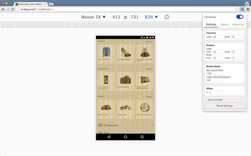
Icon
The @ebay/skin/icon module allows access to individual icons in the Skin icon font via CSS class names.
NOTE: Skin is in the midst of a transition from a font-based icon system to an SVG-based icon system. All icons listed below are being converted to SVG on a per-need basis.
IMPORTANT: Skin removes all mouse and touch events on our SVG icons due to a bug in IE. To add events to these icons you should wrap them in another element and attach your events there.
Core Icons
- icon--alert
- icon--arrow-down
- icon--arrow-up
- icon--cart
- icon--chevron-down
- icon--chevron-left
- icon--chevron-light-left
- icon--chevron-light-right
- icon--chevron-right
- icon--chevron-up
- icon--clear
- icon--clock
- icon--close
- icon--confirmation
- icon--feedback-negative
- icon--feedback-neutral
- icon--feedback-positive
- icon--information
- icon--mail-open
- icon--mail
- icon--menu
- icon--minus
- icon--notifications
- icon--priority
- icon--profile
- icon--search
- icon--settings
- icon--star
- icon--trash
- icon--view-detail
- icon--view-grid
- icon--view-list
Null Icons
- icon--cart-null
- icon--caution-null
- icon--collections-null
- icon--glasses-null
- icon--notifications-null
- icon--pencil-null
- icon--pictures-null
- icon--sell-null
- icon--shopping-null
Editing Icons
- icon--bold
- icon--bulleted-list
- icon--center-aligned
- icon--center-justified
- icon--italic
- icon--justified
- icon--left-aligned
- icon--left-justified
- icon--link
- icon--numbered-list
- icon--right-aligned
- icon--right-justified
- icon--strike-thru
- icon--underline
Selling Icons
- icon--auction
- icon--best-offer
- icon--checkout-complete
- icon--classified-ad
- icon--fixed-price
- icon--item-feedback
- icon--item-paid
- icon--item-shipped
- icon--part-paid
- icon--payment-refunded
- icon--relisted
- icon--requested-total
- icon--second-chance
- icon--seller-feedback
Misc Icons
- icon--autocomplete
- icon--box
- icon--call
- icon--camera
- icon--chat
- icon--check
- icon--checkbox-checked
- icon--checkbox-unchecked
- icon--chevron-down-disabled
- icon--chevron-left-disabled
- icon--chevron-right-disabled
- icon--chevron-up-disabled
- icon--comments
- icon--fire
- icon--follow
- icon--help
- icon--magnify
- icon--play
- icon--pause
- icon--radio-checked
- icon--radio-unchecked
- icon--save
- icon--sell
- icon--sort
- icon--success
- icon--tag
- icon--window
Less
The @ebay/skin/less module enables developers to access our Skin-related Less variables & mixins in their application.
Our Less module is not intended as a general-purpose library of utility mixins and variables (i.e. it is not LessHat!).
{
    "dependencies": {
      "lasso": "^3",
      "lasso-less": "^3",
      "@ebay/skin": "^5"
    }
}
NOTE: This module requires the additional lasso-less plugin dependency in your app package.json:
Core Icons
The @ebay/skin/less module allows access to individual icons in the Skin icon font via LESS mixins.
Please refer to the icon module for the full list of icon names. When using the icons as a mixin, simply postfix any of those icon names with -mixin in your LESS file.
Core Colors
Text Colors
Interface Colors
Infographic Colors
Mobile Font Hierarchy
- .font-hierarchy-mobile-jumbo;
- .font-hierarchy-mobile-headline-1;
- .font-hierarchy-mobile-headline-2;
- .font-hierarchy-mobile-title-1;
- .font-hierarchy-mobile-title-2;
- .font-hierarchy-mobile-title-3;
- .font-hierarchy-mobile-body-1;
- .font-hierarchy-mobile-body-2;
- .font-hierarchy-mobile-caption-1;
- .font-hierarchy-mobile-caption-2;
Desktop Font Hierarchy
- .font-hierarchy-desktop-jumbo;
- .font-hierarchy-desktop-headline-1;
- .font-hierarchy-desktop-headline-2;
- .font-hierarchy-desktop-title-1;
- .font-hierarchy-desktop-title-2;
- .font-hierarchy-desktop-title-3;
- .font-hierarchy-desktop-body-1;
- .font-hierarchy-desktop-body-2;
- .font-hierarchy-desktop-caption-1;
- .font-hierarchy-desktop-caption-2;
@ebay/skin/listbox
A listbox is intended for use as a custom implementation of the native HTML select element.
Because the listbox pattern uses a button element, it's value will not be submitted along with other form data without the assistance of JavaScript.
NOTE: only limited expand & collapse behaviour has been implemented in the listbox examples. For detailed behaviour requirements, please visit the W3C's Collapsible Dropdown Listbox Example.
Default
By default, the first option should be selected if the user does not specify a selection. This matches the behaviour of a native HTML select element.
<span class="listbox">
    <button class="expand-btn expand-btn--regular" aria-expanded="false" aria-haspopup="listbox">
        <span class="expand-btn__cell">
            <span>Option 1</span>
            <span class="expand-btn__icon"></span>
        </span>
    </button>
    <div class="listbox__options" role="listbox" tabindex="-1">
        <div class="listbox__option" role="option">
            <span>Option 1</span>
            <span class="listbox__status"></span>
        </div>
        <div class="listbox__option" role="option">
            <span>Option 2</span>
            <span class="listbox__status"></span>
        </div>
        <div class="listbox__option" role="option">
            <span>Option 3</span>
            <span class="listbox__status"></span>
        </div>
    </div>
</span>
Selected State
An initial selection can be specified by applying the aria-selected state to a single option.
<span class="listbox">
    <button class="expand-btn expand-btn--regular" aria-expanded="false" aria-haspopup="listbox">
        <span class="expand-btn__cell">
            <span>Option 1</span>
            <span class="expand-btn__icon"></span>
        </span>
    </button>
    <div class="listbox__options" role="listbox" tabindex="-1">
        <div class="listbox__option" role="option">
            <span>Option 1</span>
            <span class="listbox__status"></span>
        </div>
        <div class="listbox__option" role="option" aria-selected="true">
            <span>Option 2</span>
            <span class="listbox__status"></span>
        </div>
        <div class="listbox__option" role="option">
            <span>Option 3</span>
            <span class="listbox__status"></span>
        </div>
    </div>
</span>
Borderless
Apply the expand-btn--borderless modifier to create a borderless listbox.
<span class="listbox">
    <button class="expand-btn expand-btn--regular" aria-expanded="false" aria-haspopup="listbox">
        <span class="expand-btn__cell">
            <span>Listbox</span>
            <span class="expand-btn__icon"></span>
        </span>
    </button>
    <div class="listbox__options" role="listbox" tabindex="-1">
        <div class="listbox__option" role="option">
            <span>Option 1</span>
            <span class="listbox__status"></span>
        </div>
        <div class="listbox__option" role="option">
            <span>Option 2</span>
            <span class="listbox__status"></span>
        </div>
        <div class="listbox__option" role="option">
            <span>Option 3</span>
            <span class="listbox__status"></span>
        </div>
    </div>
</span>
@ebay/skin/notice
The purpose of a notice is to convey the next course of action for a task or flow. The notice must be clear and concise, with minimum cognitive load.
A notice may appear at page-level or inline-level, with a status of priority, confirmation, or information.
Page Notice
A page-level notice typically appears prominently at the top of the page or directly above a module. To aid discoverabilty of such important content for assistive technology, we make each page notice a landmark region with heading.
Congrats! You just listed "Spam and Eggs From the Cow's Perspective (paperback)."
Error. Please take another look at the following:
Card number, Expiration date & Security code.
Good news! You get free shipping on your next pair of shoes! Learn more.
<section aria-labelledby="confirmation-status" class="page-notice page-notice--confirmation">
<h2 class="page-notice__status" id="confirmation-status">
<span aria-label="Confirmation" role="img"></span>
</h2>
<div class="page-notice__content">
<p><strong>Congrats!</strong> You just listed <a href="#">"Spam and Eggs From the Cow's Perspective</a> (paperback)."</p>
</div>
</section>
<section aria-labelledby="priority-status" class="page-notice page-notice--priority">
<h2 class="page-notice__status" id="priority-status">
<span aria-label="Priority" role="img"></span>
</h2>
<div class="page-notice__content">
<p><strong>Error.</strong> Please take another look at the following:<br /><a href="#">Card number</a>, <a href="#">Expiration date</a> & <a href="#">Security code</a>.</p>
</div>
</section>
<section aria-labelledby="information-status" class="page-notice page-notice--information" role="region">
<h2 class="page-notice__status" id="information-status">
<span aria-label="Information" role="img"></span>
</h2>
<div class="page-notice__content">
<p><strong>Good news!</strong> You get free shipping on your next pair of shoes! <a href="#">Learn more</a>.</p>
</div>
</section>
Dismissable Page Notice
Append a button with class page-notice__close to create a dismissable page notice.
Congrats! You just listed "Spam and Eggs From the Cow's Perspective (paperback)."
You can check your listing or sell another item
Good news! You get free shipping on your next pair of shoes! Learn more.
<section aria-labelledby="confirmation-status" class="page-notice page-notice--confirmation">
    <h2 class="page-notice__status" id="confirmation-status">
        <span aria-label="Confirmation" role="img"></span>
    </h2>
    <div class="page-notice__content">
        <p><strong>Congrats!</strong> You just listed <a href="#">"Spam and Eggs From the Cow's Perspective</a> (paperback)."</p>
        <p>You can check <a href="#">your listing</a> or <a href="#">sell another item</a></p>
    </div>
    <button aria-label="Dismiss notice" class="page-notice__close">
        <span></span>
    </button>
</section>

<section aria-labelledby="information-status" class="page-notice page-notice--information" role="region">
    <h2 class="page-notice__status" id="information-status">
        <span aria-label="Information" role="img"></span>
    </h2>
    <div class="page-notice__content">
        <p><strong>Good news!</strong> You get free shipping on your next pair of shoes! <a href="#">Learn more</a>.</p>
    </div>
    <button aria-label="Dismiss notice" class="page-notice__close">
        <span></span>
    </button>
</section>
Call-to-Action Page Notice
Use an anchor or button tag to create a 'call-to-action' page notice tile.
IMPORTANT: A call-to-action can only have one action, i.e. a link or button tag cannot contain any nested links or buttons.
 <span aria-labelledby="confirmation-status" role="region">
     <a href="http://www.ebay.com" class="page-notice page-notice--confirmation page-notice--fluid">
         <h2 class="page-notice__status">
             <span aria-label="Confirmation notice" id="confirmation-status" role="img"></span>
         </h2>
         <span class="page-notice__content page-notice__content--align-middle">
             <p>Congrats! You are the highest bidder!</p>
         </span>
         <span class="page-notice__cta"></span>
     </a>
 </span>
Inline Notice
An inline-level notice is typically located near a form field or user interface control.
Delivered on May 1, 2017
Tracking number: 93878473859376898908657567
Update your credit card.
Global Shipping Program transaction.
<div class="inline-notice inline-notice--confirmation">
    <span class="inline-notice__status">
        <span aria-label="Confirmation" role="img"></span>
    </span>
    <span class="inline-notice__content">
        <p>Delivered on May 1, 2017</p>
        <p>Tracking number: <a href="#">93878473859376898908657567</a></p>
    </span>
</div>

<div class="inline-notice inline-notice--priority">
    <span class="inline-notice__status">
        <span aria-label="Priority" role="img"></span>
    </span>
    <span class="inline-notice__content">
        <p>Update your credit card.</p>
    </span>
</div>

<div class="inline-notice inline-notice--information">
    <span class="inline-notice__status">
        <span aria-label="Information" role="img"></span>
    </span>
    <span class="inline-notice__content">
        <p>Global Shipping Program transaction.</p>
    </span>
</div>
Flyout Notice
A flyout-level notice points to a specific section or element of the page. We can also says this element hosts the flyout.
The DOM order of the notice and it's host is important! To avoid keyboard and screen reader accessibility issues, the flyout element's DOM position should be adjacent to it's host.
Flyout notices are absolutely positioned by default. The flyout will be positioned relatively to the nearest ancestor with position:relative.
The flyout pointer can be positioned using any one of the following elements: flyout-notice__pointer-top-left, flyout-notice__pointer-top-center, flyout-notice__pointer-top-right, flyout-notice__pointer-bottom-right, flyout-notice__pointer-bottom-center, flyout-notice__pointer-bottom-left, flyout-notice__pointer-left or flyout-notice__pointer-right.
We had trouble connecting to PayPal. Please make your payment later.
Congrats! You are currently the high bidder, but you are close to getting outbid.
We could not find any items that match your search. Try expanding your search to find more items.
<div class="flyout-notice flyout-notice--priority">
    <span class="flyout-notice__content">
        <p>We had trouble connecting to PayPal. Please make your payment later.</p>
    </span>
    <button aria-label="Dismiss notice" class="flyout-notice__close" type="button">
        <span aria-hidden="true" role="img"></span>
    </button>
    <span class="flyout-notice__pointer-top-left"></span>
    </div>
    <div class="flyout-notice flyout-notice--confirmation">
    <span class="flyout-notice__content">
        <p>Congrats! You are currently the high bidder, but you are close to getting outbid.</p>
    </span>
    <button aria-label="Dismiss notice" class="flyout-notice__close" type="button">
        <span aria-hidden="true" role="img"></span>
    </button>
    <span class="flyout-notice__pointer-bottom-left"></span>
    </div>
    <div class="flyout-notice flyout-notice--information">
    <span class="flyout-notice__content">
        <p>We could not find any items that match your search. Try expanding your search to find more items.</p>
        <p><a href="http://www.ebay.com">Use fewer refinements.</a></p>
    </span>
    <button aria-label="Dismiss notice" class="flyout-notice__close" type="button">
        <span aria-hidden="true" role="img"></span>
    </button>
    <span class="flyout-notice__pointer-right"></span>
</div>
Tooltip
A flyout-notice can be used as the overlay of a tooltip pattern.
Apply modifier class tooltip--expanded to the widget to display the overlay.
<span class="tooltip">
    <button aria-label="Settings" accesskey="s" class="tooltip__host icon-btn" aria-describedby="tooltip-0" aria-expanded="false">
        <svg aria-hidden="true" class="svg-icon" focusable="false" width="16" height="16">
            <use xlink:href="#icon-settings"></use>
        </svg>
    </button>
    <div id="tooltip-0" class="tooltip__overlay flyout-notice flyout-notice--information" role="tooltip">
        <div class="flyout-notice flyout-notice--information">
            <span class="flyout-notice__content">
                <p>Use Access Key 'S' to display settings.</p>
            </span>
            <span class="flyout-notice__pointer-bottom-left"></span>
        </div>
    </div>
</span>
Bubble-Help
A flyout-notice can be used as the overlay of a bubble help pattern.
Apply an aria-expanded state of true to the help button to display the overlay.
<span class="bubblehelp">
    <button aria-label="Help" class="icon-btn bubblehelp__host" type="button" aria-expanded="false">
        <svg aria-hidden="true" class="svg-icon" focusable="false" width="16" height="16">
            <use xlink:href="#icon-information"></use>
        </svg>
    </button>
    <div class="bubblehelp__overlay">
        <div class="flyout-notice flyout-notice--information">
            <span class="flyout-notice__content">
                <p>Here's a tip to help you be successful at your task:</p>
                <p><a href="http://www.ebay.com">Use fewer refinements.</a></p>
            </span>
            <span class="flyout-notice__pointer-top-left"></span>
        </div>
    </div>
</span>@ebay/skin/pagination
Pagination allows a user to navigate back and forwards through a URL based dataset, or jump directly to any specific URL in that set.
Pagination links may update the results immediately on the client via AJAX, or on the server via a full page reload.
<nav class="pagination" aria-labelledby="pagination-heading" role="navigation">
    <span aria-live="polite" role="status">
        <h2 class="clipped" id="pagination-heading">Results Pagination - Page 1</h2>
    </span>
    <a aria-disabled="true" aria-label="Previous Page" class="pagination__previous" href="http://www.ebay.com/sch/i.html?_nkw=guitars">
        <span></span>
    </a>
    <ol class="pagination__items">
        <li>
            <a aria-current="page" href="http://www.ebay.com/sch/i.html?_nkw=guitars" class="pagination__item">1</a>
        </li>
        <li>
            <a href="http://www.ebay.com/sch/i.html?_nkw=guitars&_pgn=2" class="pagination__item">2</a>
        </li>
        <li>
            <a href="http://www.ebay.com/sch/i.html?_nkw=guitars&_pgn=3" class="pagination__item">3</a>
        </li>
        ...
    </ol>
    <a aria-label="Next Page" class="pagination__next" href="http://www.ebay.com/sch/i.html?_nkw=guitars&_pgn=2">
        <span></span>
    </a>
</nav>
When performing client side navigation prefer using buttons instead of links like so.
        <nav class="pagination" aria-labelledby="pagination-heading" role="navigation">
            <span aria-live="polite" role="status">
                <h2 class="clipped" id="pagination-heading">Results Pagination - Page 1</h2>
            </span>
            <button aria-disabled="true" aria-label="Previous Page" class="pagination__previous">
                <span></span>
            </button>
            <ol class="pagination__items">
                <li>
                    <button aria-current="page" class="pagination__item">1</a>
                </li>
                <li>
                    <button class="pagination__item">2</a>
                </li>
                <li>
                    <button class="pagination__item">3</a>
                </li>
                ...
            </ol>
            <button aria-label="Next Page" class="pagination__next">
                <span></span>
            </button>
        </nav>
Fluid Pagination
Apply the pagination--fluid modifier class to fill all available horizontal space. Horizontal space will be distributed around each pagination item as necessary.
<nav class="pagination pagination--fluid" aria-labelledby="pagination-heading" role="navigation">
    <span aria-live="polite" role="status">
        <h2 class="clipped" id="pagination-heading">Results Pagination - Page 1</h2>
    </span>
    <a aria-disabled="true" aria-label="Previous Page" class="pagination__previous" href="http://www.ebay.com/sch/i.html?_nkw=guitars">
        <span></span>
    </a>
    <ol class="pagination__items">
        <li>
            <a aria-current="page" href="http://www.ebay.com/sch/i.html?_nkw=guitars" class="pagination__item">1</a>
        </li>
        <li>
            <a href="http://www.ebay.com/sch/i.html?_nkw=guitars&_pgn=2" class="pagination__item">2</a>
        </li>
        <li>
            <a href="http://www.ebay.com/sch/i.html?_nkw=guitars&_pgn=3" class="pagination__item">3</a>
        </li>
        ...
    </ol>
    <a aria-label="Next Page" class="pagination__next" href="http://www.ebay.com/sch/i.html?_nkw=guitars&_pgn=2">
        <span></span>
    </a>
</nav>
NOTE: The heading need only be wrapped in an ARIA live-region if client-side pagination is implemented (i.e. partial page updates).
@ebay/skin/radio
A radio button is a form control that allows a user to select a single option from a group of choices.
The purpose of a radio button is to collect form data. Therefore, radio buttons should always be used in conjunction with a form, label and submit button.
Default Radio
Use the radio base class to create a styled radio.
The radio is decoupled from it's text label to allow more flexibility in terms of layout. How and where you provide this label is up to you, but do not forget it!
<span class="radio">
    <input class="radio__control" type="radio" />
    <span class="radio__icon"></span>
</span>
Disabled Radio
Use the disabled attribute to disable any radio input.
<span class="radio">
    <input class="radio__control" type="radio" checked disabled />
    <span class="radio__icon"></span>
</span>
Grouped Radio
A group of radios enforces single-select (unlike a group of checkboxes which allows multi-select).
A fieldset and legend are required in order to create the correct grouping semantics. Note that the Skin global module removes the default fieldset border and padding.
TIP: To stack radio buttons vertically instead of side-by-side, simply replace the span wrapper with a div wrapper.
<fieldset>
    <legend>Choose an Option</legend>
    <span class="field">
        <span class="field__control radio">
            <input class="radio__control" id="group-radio-1" type="radio" value="1" name="radio-group" />
            <span class="radio__icon"></span>
        </span>
        <label class="field__label field__label--end" for="group-radio-1">Option 1</label>
    </span>
    <span class="field">
        <span class="field__control radio">
            <input class="radio__control" id="group-radio-2" type="radio" value="2" name="radio-group" />
            <span class="radio__icon"></span>
        </span>
        <label class="field__label field__label--end" for="group-radio-2">Option 2</label>
    </span>
    <span class="field">
        <span class="field__control radio">
            <input class="radio__control" id="group-radio-3" type="radio" value="3" name="radio-group" />
            <span class="radio__icon"></span>
        </span>
        <label class="field__label field__label--end" for="group-radio-3">Option 3</label>
    </span>
</fieldset>
Custom Radio
The default radio shown above uses an SVG background image, and therefore has a fixed colour. Inline SVG, while slightly more verbose, honours the CSS cascade, thus allowing any possible colour for the radio icon.
<span class="radio" style="color: #5ba71b">
    <input class="radio__control" type="radio" />
    <span class="radio__icon" hidden>
        <svg aria-hidden="true" class="radio__unchecked" focusable="false">
            <use xlink:href="#icon-radio-unchecked"></use>
        </svg>
        <svg aria-hidden="true" class="radio__checked" focusable="false">
            <use xlink:href="#icon-radio-checked"></use>
        </svg>
    </span>
</span>
NOTE: The hidden property ensures that the SVG icon is not visible alongside the native icon when the page is in a non-CSS state. This hidden property will be overriden by CSS.
The radio module can use any inline SVG for it's checked and unchecked states.
<span class="field__control radio" style="color: #5ba71b">
    <input class="radio__control" id="custom-radio-1" type="radio" value="1" name="radio-custom" />
    <span class="radio__icon" hidden>
        <svg aria-hidden="true" class="radio__unchecked" focusable="false">
            <use xlink:href="#icon-radio-unchecked"></use>
        </svg>
        <svg aria-hidden="true" class="radio__checked" focusable="false">
            <use xlink:href="#icon-confirmation"></use>
        </svg>
    </span>
</span>
Be careful when using a custom radio; the icon for each state must still give enough affordance to a user that it represents an interactive control.
@ebay/skin/select
A select allows the user to select one item from a list of options. A select is exactly the same as a normal HTML select (because it is one), but Skin's version uses a wrapper to style it.
The purpose of a select is to collect form data; therefore a select should always be used in conjunction with a form, label and submit button. If you are not submitting form data, then a menu maybe a better choice.
IMPORTANT: The examples below show the select in isolation, without any label. Please see the field module for details on labeling controls. Remember: every select requires a label!
Default select
<span class="select">
    <select name="options">
        <option value="item1">Option 1</option>
        <option value="item2">Option 2</option>
        <option value="item3">Option 3</option>
    </select>
    <span class="select__icon"></span>
</span>
Disabled select
<span class="select">
    <select name="options" disabled>
        <option value="item1">Option 1</option>
        <option value="item2" selected>Option 2</option>
        <option value="item3">Option 3</option>
    </select>
    <span class="select__icon"></span>
</span>
Selected option
<span class="select">
    <select name="options">
        <option value="item1">Option 1</option>
        <option value="item2" selected>Option 2</option>
        <option value="item3">Option 3</option>
        <span class="select__icon"></span>
    </select>
</span>
Unselected Select
If no suitable default value exists, the first option in the list can be used as a prompt and set to disabled & selected.
<span class="select">
    <select>
        <option value="0" disabled selected>-select-</option>
        <option value="1">Option 1</option>
        <option value="2">Option 2</option>
        <option value="3">Option 3</option>
    </select>
    <span class="select__icon"></span>
</span>
Fluid select
<span class="select select--fluid">
    <select name="options" id="options">
        <option value="item1">Option 1</option>
        <option value="item2" selected>Option 2</option>
        <option value="item3">Option 3</option>
    </select>
    <span class="select__icon"></span>
</span>
Borderless select
<span class="select select--borderless">
    <select name="options" id="options">
        <option value="item1">Option 1</option>
        <option value="item2" selected>Option 2</option>
        <option value="item3">Option 3</option>
    </select>
    <span class="select__icon"></span>
</span>
Borderless, disabled select
<span class="select select--borderless">
    <select name="options" id="options" disabled>
        <option value="item1">Option 1</option>
        <option value="item2" selected>Option 2</option>
        <option value="item3">Option 3</option>
    </select>
    <span class="select__icon"></span>
</span>
Right-to-left select
<span class="select" dir="rtl">
    <select name="options" id="options">
        <option value="item1">Option 1</option>
        <option value="item2" selected>Option 2</option>
        <option value="item3">Option 3</option>
    </select>
    <span class="select__icon"></span>
</span>
Foreground icon select
<span class="select">
    <select name="options" id="options">
        <option value="item1">Option 1</option>
        <option value="item2" selected>Option 2</option>
        <option value="item3">Option 3</option>
    </select>
    <svg aria-hidden="true" class="select__icon" focusable="false">
        <use xlink:href="#icon-settings"></use>
    </svg>
</span>
Small Select
For a small select, apply the select--small modifier.
<span class="select select--small">
    <select>
        <option value="0" disabled selected>Choose a Size</option>
        <option value="1">Option 1</option>
        <option value="2">Option 2</option>
        <option value="3">Option 3</option>
    </select>
    <span class="select__icon"></span>
</span>
Large Select
For a large select, apply the select--large modifier.
<span class="select select--large">
    <select>
        <option value="0" disabled selected>Choose a Size</option>
        <option value="1">Option 1</option>
        <option value="2">Option 2</option>
        <option value="3">Option 3</option>
    </select>
    <span class="select__icon"></span>
</span>
Spinner
A spinner animation is used to convey a busy or loading state.
A spinner is considered a critical graphic, therefore an img role and aria-label property are required.
<span class="spinner" aria-label="Busy animation" role="img"></span>
Large Spinner
Use the spinner--large modifier class to create a large spinner.
<span class="spinner spinner--large" aria-label="Busy" role="img"></span>
SVG
The SVG module imports an external SVG source file containing all symbol definitions. However, due to a lack of browser support for external SVG definitions, we recommend not using this module for now and instead inlining (i.e. copy & pasting) all required definitions from below into a hidden SVG block on your page.
Arrows
<svg hidden>
    <symbol id="icon-arrow-down" viewBox="0 0 24 13">
        <path d="M11.604 12.921L0 0h23.215l-5.807 6.462z" />
    </symbol>
    <symbol id="icon-arrow-down-disabled" viewBox="0 0 24 13">
        <path fill="#ccc" d="M11.604 12.921L0 0h23.215l-5.807 6.462z" />
    </symbol>
    <symbol id="icon-arrow-up" viewBox="0 0 24 13">
        <path d="M12.045.029L23.649 12.95H.434l5.807-6.462z" />
    </symbol>
</svg>
<svg aria-hidden="true" class="svg-icon" focusable="false" height="16" width="16">
    <use xlink:href="#icon-arrow-down"></use>
</svg>
<svg aria-hidden="true" class="svg-icon" focusable="false" height="16" width="16">
    <use xlink:href="#icon-arrow-down-disabled"></use>
</svg>
<svg aria-hidden="true" class="svg-icon" focusable="false" height="16" width="16">
    <use xlink:href="#icon-arrow-up"></use>
</svg>
Chevrons
<svg hidden>
    <symbol id="icon-chevron-down" viewBox="0 0 24 14">
        <path d="M2.905-.023l11.542 11.544-2.448 2.449L.455 2.426l2.45-2.449zM9.55 11.521L21.095-.024l2.45 2.449L11.999 13.97 9.55 11.521z" />
    </symbol>
    <symbol id="icon-chevron-left" viewBox="0 0 14 24">
        <path d="M13.993 2.45L2.449 13.992 0 11.544 11.545 0l2.449 2.45h-.001zM2.449 9.096l11.545 11.545-2.449 2.45L0 11.546l2.449-2.45z" />
    </symbol>
    <symbol id="icon-chevron-right" viewBox="0 0 14 23">
        <path d="M0 20.502L11.469 9.036l2.433 2.432L2.433 22.936 0 20.502zm11.469-6.601L0 2.433 2.433 0l11.469 11.469-2.433 2.433v-.001z" />
    </symbol>
    <symbol id="icon-chevron-up" viewBox="0 0 24 14">
        <path d="M20.641 13.993L9.099 2.449 11.547 0l11.544 11.545-2.45 2.448zM13.995 2.449L2.45 13.994 0 11.545 11.546 0l2.449 2.449z" />
    </symbol>
</svg>
<svg aria-hidden="true" class="icon icon--chevron-down" focusable="false" height="16" width="16">
    <use xlink:href="#icon-chevron-down"></use>
</svg>
<svg aria-hidden="true" class="icon icon--chevron-left" focusable="false" height="16" width="16">
    <use xlink:href="#icon-chevron-left"></use>
</svg>
<svg aria-hidden="true" class="icon icon--chevron-right" focusable="false" height="16" width="16">
    <use xlink:href="#icon-chevron-right"></use>
</svg>
<svg aria-hidden="true" class="icon icon--chevron-up" focusable="false" height="16" width="16">
    <use xlink:href="#icon-chevron-up"></use>
</svg>
Light Chevrons
<svg hidden>
    <symbol id="icon-chevron-light-left" viewBox="0 0 13 23">
        <path d="M12.118.263a.92.92 0 0 0-1.288 0L.293 10.8c-.176.176-.293.41-.293.644 0 .234.117.468.293.644l10.185 10.185c.176.176.41.293.644.293.234 0 .468-.117.644-.293a.92.92 0 0 0 0-1.288l-9.541-9.54 9.893-9.894a.92.92 0 0 0 0-1.288z" />
    </symbol>
    <symbol id="icon-chevron-light-right" viewBox="0 0 13 23">
        <path d="M.263.263a.92.92 0 0 1 1.288 0L12.088 10.8c.176.176.293.41.293.644 0 .234-.117.468-.293.644L1.903 22.273c-.176.176-.41.293-.644.293-.234 0-.468-.117-.644-.293a.92.92 0 0 1 0-1.288l9.541-9.54L.263 1.55a.92.92 0 0 1 0-1.288z" />
    </symbol>
</svg>
<svg aria-hidden="true" class="icon icon--chevron-light-left" focusable="false" height="16" width="16">
    <use xlink:href="#icon-chevron-light-left"></use>
</svg>
<svg aria-hidden="true" class="icon icon--chevron-light-right" focusable="false" height="16" width="16">
    <use xlink:href="#icon-chevron-light-right"></use>
</svg>
Status
<svg hidden>
    <symbol id="icon-confirmation" viewBox="0 0 24 24">
        <path fill="#5ba71b" d="M12.007 24.014C5.376 24.014 0 18.638 0 12.007 0 5.376 5.376 0 12.007 0c6.631 0 12.007 5.376 12.007 12.007v.015c-.008 6.625-5.381 11.992-12.007 11.992zm0-22.261c-5.671 0-10.268 4.597-10.268 10.268s4.597 10.268 10.268 10.268 10.268-4.597 10.268-10.268S17.678 1.753 12.007 1.753zM11.13 17.6h-.003a.736.736 0 0 1-.485-.182L5.968 13.44a.74.74 0 1 1 .961-1.125l4.076 3.477 6.136-8.056a.744.744 0 1 1 1.181.906l-6.607 8.68a.722.722 0 0 1-.512.292h-.087l.014-.014z"/>
    </symbol>

    <symbol id="icon-information" viewBox="0 0 24 24">
        <path fill="#0654ba" d="M12.007 9.753a.849.849 0 0 0-.849.849v6.553a.85.85 0 0 0 1.683.004v-6.557a.849.849 0 0 0-.834-.849zm1.057-2.88a1.016 1.016 0 1 1-2.032 0 1.016 1.016 0 0 1 2.032 0zm-1.057 17.141C5.376 24.014 0 18.638 0 12.007 0 5.376 5.376 0 12.007 0c6.631 0 12.007 5.376 12.007 12.007v.015c-.008 6.625-5.381 11.992-12.007 11.992zm0-22.261c-5.671 0-10.268 4.597-10.268 10.268s4.597 10.268 10.268 10.268 10.268-4.597 10.268-10.268S17.678 1.753 12.007 1.753z"/>
    </symbol>

    <symbol id="icon-priority" viewBox="0 0 24 24">
        <path fill="#dd1e31" d="M12.007 14.261a.849.849 0 0 1-.849-.849V6.859a.849.849 0 1 1 1.684.005v6.549a.849.849 0 0 1-.834.849l-.001-.001zm1.057 2.894a1.016 1.016 0 1 1-2.032 0 1.016 1.016 0 0 1 2.032 0zm-1.057 6.859C5.376 24.014 0 18.638 0 12.007 0 5.376 5.376 0 12.007 0c6.631 0 12.007 5.376 12.007 12.007v.015c-.008 6.625-5.381 11.992-12.007 11.992zm0-22.261c-5.671 0-10.268 4.597-10.268 10.268s4.597 10.268 10.268 10.268 10.268-4.597 10.268-10.268S17.678 1.753 12.007 1.753z"/>
    </symbol>
</svg>
<svg aria-hidden="true" class="icon icon--confirmation" focusable="false" height="16" width="16">
    <use xlink:href="#icon-confirmation"></use>
</svg>
<svg aria-hidden="true" class="icon icon--information" focusable="false" height="16" width="16">
    <use xlink:href="#icon-information"></use>
</svg>
<svg aria-hidden="true" class="icon icon--priority" focusable="false" height="16" width="16">
    <use xlink:href="#icon-priority"></use>
</svg>
View Options
<svg hidden>
    <symbol id="icon-view-detail" viewBox="0 0 22 23">
        <path d="M21.824 13.591a.599.599 0 0 1-.597.597H.597A.599.599 0 0 1 0 13.591V.597C0 .269.268 0 .597 0h20.63a.6.6 0 0 1 .597.597v12.994zm.069 8.212a.6.6 0 0 1-.597.597H.684a.6.6 0 0 1-.597-.597v-4.352c0-.328.268-.597.597-.597h20.613a.6.6 0 0 1 .597.597v4.352h-.001z"/>
    </symbol>
    <symbol id="icon-view-grid" viewBox="0 0 22 22">
        <path d="M9.475 8.876a.599.599 0 0 1-.597.597H.597A.6.6 0 0 1 0 8.876V.597C0 .269.268 0 .597 0h8.281c.328 0 .597.268.597.597v8.279zm0 12.379a.599.599 0 0 1-.597.597H.597A.599.599 0 0 1 0 21.255v-8.278c0-.328.268-.597.597-.597h8.281c.328 0 .597.268.597.597v8.278zM21.857 8.876a.6.6 0 0 1-.597.597h-8.28a.6.6 0 0 1-.597-.597V.597c0-.328.268-.597.597-.597h8.28c.328 0 .597.268.597.597v8.279zm0 12.379a.6.6 0 0 1-.597.597h-8.28a.599.599 0 0 1-.597-.597v-8.278c0-.328.268-.597.597-.597h8.28c.328 0 .597.268.597.597v8.278z"/>
    </symbol>
    <symbol id="icon-view-list" viewBox="0 0 23 23">
        <path d="M5.546 4.947a.6.6 0 0 1-.597.597H.597A.6.6 0 0 1 0 4.947V.597C0 .269.268 0 .597 0h4.352a.6.6 0 0 1 .597.597v4.35zm17.242 0a.599.599 0 0 1-.597.597H8.589a.6.6 0 0 1-.597-.597V.597A.6.6 0 0 1 8.589 0h13.602a.6.6 0 0 1 .597.597v4.35zM5.546 13.226a.6.6 0 0 1-.597.597H.597A.599.599 0 0 1 0 13.226V8.875c0-.328.268-.597.597-.597h4.352a.6.6 0 0 1 .597.597v4.351zm17.242 0a.599.599 0 0 1-.597.597H8.589a.599.599 0 0 1-.597-.597V8.875a.6.6 0 0 1 .597-.597h13.602a.6.6 0 0 1 .597.597v4.351zM5.546 21.503a.6.6 0 0 1-.597.597H.597A.599.599 0 0 1 0 21.503v-4.351c0-.328.268-.597.597-.597h4.352c.328 0 .597.268.597.597v4.351zm17.242 0a.599.599 0 0 1-.597.597H8.589a.599.599 0 0 1-.597-.597v-4.351a.6.6 0 0 1 .597-.597h13.602c.328 0 .597.268.597.597v4.351z"/>
    </symbol>
</svg>
<svg aria-hidden="true" class="icon icon--view-detail" focusable="false" height="16" width="16">
    <use xlink:href="#icon-view-detail"></use>
</svg>
<svg aria-hidden="true" class="icon icon--view-grid" focusable="false" height="16" width="16">
    <use xlink:href="#icon-view-grid"></use>
</svg>
<svg aria-hidden="true" class="icon icon--view-list" focusable="false" height="16" width="16">
    <use xlink:href="#icon-view-list"></use>
</svg>
Form Controls
<svg hidden>
    <symbol id="icon-checkbox-checked" viewBox="0 0 23 24">
        <path d="M0 4.235A4.237 4.237 0 0 1 4.237 0h14.482a4.228 4.228 0 0 1 4.237 4.235v15.529a4.237 4.237 0 0 1-4.237 4.235H4.237A4.228 4.228 0 0 1 0 19.764V4.235zm3.577 8.955l5.279 5.129L19.229 8.24l-1.977-1.921-8.197 7.965-3.332-3.237-2.146 2.143z"/>
    </symbol>
    <symbol id="icon-checkbox-unchecked" viewBox="0 0 23 24">
        <path d="M18.361 24.046H4.701A4.705 4.705 0 0 1 0 19.348V4.701A4.707 4.707 0 0 1 4.701 0h13.66a4.707 4.707 0 0 1 4.701 4.701v14.647a4.706 4.706 0 0 1-4.701 4.698zM4.701 1.411A3.292 3.292 0 0 0 1.412 4.7v14.647a3.291 3.291 0 0 0 3.289 3.287h13.66a3.291 3.291 0 0 0 3.289-3.287V4.7a3.292 3.292 0 0 0-3.289-3.289H4.701z"/>
    </symbol>
    <symbol id="icon-radio-checked" viewBox="0 0 24 24">
        <path d="M11.789 23.4C5.289 23.4 0 18.152 0 11.7 0 5.249 5.289 0 11.789 0s11.789 5.249 11.789 11.7c0 6.453-5.289 11.7-11.789 11.7zm0-22.067C6.024 1.333 1.333 5.984 1.333 11.7c0 5.716 4.691 10.367 10.456 10.367S22.245 17.416 22.245 11.7c0-5.716-4.691-10.367-10.456-10.367zm6.104 10.219c0 3.305-2.787 5.984-6.224 5.984-3.437 0-6.224-2.679-6.224-5.984s2.787-5.984 6.224-5.984c3.437 0 6.224 2.679 6.224 5.984z"/>
    </symbol>
    <symbol id="icon-radio-unchecked" viewBox="0 0 24 24">
        <path d="M11.789 23.4C5.289 23.4 0 18.151 0 11.7S5.289 0 11.789 0s11.789 5.249 11.789 11.7c0 6.453-5.289 11.7-11.789 11.7zm0-22.067C6.024 1.333 1.333 5.984 1.333 11.7c0 5.716 4.691 10.367 10.456 10.367S22.245 17.416 22.245 11.7c0-5.716-4.691-10.367-10.456-10.367z"/>
    </symbol>
</svg>
<svg aria-hidden="true" class="icon icon--checkbox-unchecked" focusable="false" height="16" width="16">
    <use xlink:href="#icon-checkbox-unchecked"></use>
</svg>
<svg aria-hidden="true" class="icon icon--checkbox-checked" focusable="false" height="16" width="16">
    <use xlink:href="#icon-checkbox-checked"></use>
</svg>
<svg aria-hidden="true" class="icon icon--radio-unchecked" focusable="false" height="16" width="16">
    <use xlink:href="#icon-radio-unchecked"></use>
</svg>
<svg aria-hidden="true" class="icon icon--radio-checked" focusable="false" height="16" width="16">
    <use xlink:href="#icon-radio-checked"></use>
</svg>
Misc
<svg hidden>
    <symbol id="icon-cart" viewBox="0 0 30 24">
        <path d="M29.564 5.561c-.293-.468-.937-1.054-2.224-1.054-1.405-.059-18.207 0-19.202 0L6.675.585A.88.88 0 0 0 5.855 0H.878C.351 0 0 .351 0 .878s.351.878.878.878h4.39l5.738 15.22a.88.88 0 0 0 .82.585h13.817c.527 0 .937-.293 1.112-.761.117-.293.761-2.049 1.405-3.805.644-1.815 1.346-3.688 1.522-4.273.469-1.288.41-2.4-.117-3.161zm-1.522 2.517c-.234.585-.878 2.459-1.58 4.273a107.382 107.382 0 0 0-1.23 3.454h-12.82l-3.63-9.541h18.5c.293 0 .644.059.82.293.234.234.176.82-.059 1.522v-.001zM14.695 21.6a2.166 2.166 0 1 1-4.333 0 2.166 2.166 0 0 1 4.333 0zm12.645 0a2.166 2.166 0 1 1-4.333 0 2.166 2.166 0 0 1 4.333 0z"/>
    </symbol>

    <symbol id="icon-close" viewBox="0 0 24 24">
        <path d="M23.205 1.79L21.415 0l-9.813 9.812L1.79 0 0 1.79l9.812 9.812L0 21.415l1.79 1.789 9.812-9.811 9.813 9.811 1.79-1.789-9.813-9.813z"/>
    </symbol>

    <symbol id="icon-menu" viewBox="0 0 21 18">
        <path d="M19.234 2.62H1.205a.862.862 0 0 1-.878-.878c0-.527.41-.878.878-.878h18.029a.9.9 0 0 1 .878.878.9.9 0 0 1-.878.878zm0 14.517H1.205a.9.9 0 0 1-.878-.878.9.9 0 0 1 .878-.878h18.029a.9.9 0 0 1 .878.878.9.9 0 0 1-.878.878zm0-7.493H1.205a.9.9 0 0 1-.878-.878.9.9 0 0 1 .878-.878h18.029a.9.9 0 0 1 .878.878.9.9 0 0 1-.878.878z"/>
    </symbol>

    <symbol id="icon-notifications" viewBox="0 0 24 24">
        <path d="M12.048 23.59c1.229 0 2.224-.995 2.224-2.166h-4.39c-.06 1.171.937 2.166 2.166 2.166zm11.532-4.566s-2.166-1.756-3.337-3.102c-.937-1.112-.937-2.517-.937-4.332 0-2.4.059-5.444-2.693-8.429C15.442 1.873 14.037 1.288 13.1.995 13.04.41 12.516 0 11.93 0c-.586 0-1.054.41-1.171.995-.995.293-2.341.878-3.512 2.166C4.496 6.146 4.496 9.19 4.554 11.59c0 1.815.059 3.22-.937 4.332C2.446 17.268.339 19.024.28 19.024c-.234.176-.351.527-.234.82.117.293.35.468.702.468h22.244a.76.76 0 0 0 .702-.468c.234-.293.117-.644-.117-.82h.003zm-11.532-.175h-9.25a31.656 31.656 0 0 0 1.99-1.99c1.347-1.522 1.289-3.337 1.289-5.268 0-2.4-.06-4.859 2.34-7.434C9.94 2.459 11.99 2.225 11.99 2.225h.059s2.049.234 3.57 1.932c2.342 2.576 2.342 5.034 2.342 7.434 0 1.932-.06 3.746 1.288 5.268a31.656 31.656 0 0 0 1.99 1.99h-9.19z"/>
    </symbol>

    <symbol id="icon-profile" viewBox="0 0 22 22">
        <path d="M8.854 0h3.539c3.489 0 3.979 4.028 3.979 4.028s-.014 4.239-.014 5.237c0 .313-2.189 6.226-2.189 6.226l7.074 3.544s-1.268 2.201-2.658 2.201-13.022.014-15.927.014C1.31 21.25 0 19.036 0 19.036l7.107-3.586S4.878 9.752 4.878 9.266c0-1.247-.027-5.279-.027-5.279S5.531 0 8.854 0z"/>
    </symbol>

    <symbol id="icon-search" viewBox="0 0 20 20">
        <path d="M19.786 18.557l-5.093-5.093a8.1 8.1 0 0 0 1.873-5.21C16.507 3.747 12.82 0 8.254 0 3.688 0 0 3.746 0 8.254c0 4.508 3.688 8.312 8.254 8.312 2.049 0 3.863-.761 5.327-1.932l5.093 5.093a.714.714 0 0 0 .527.234c.176 0 .41-.059.527-.234.351-.351.351-.878.059-1.171l-.001.001zM1.581 8.254a6.67 6.67 0 0 1 6.673-6.673 6.67 6.67 0 0 1 6.673 6.673c0 3.688-2.985 6.732-6.673 6.732s-6.673-2.985-6.673-6.732z"/>
    </symbol>

    <symbol id="icon-settings" viewBox="0 0 22 22">
        <path d="M20.913 12.552h-1.002c-.458 0-.948.359-1.086.797l-.576 1.403c-.217.405-.127 1.006.195 1.329l.714.712a.839.839 0 0 1 0 1.184l-1.186 1.183a.838.838 0 0 1-1.182 0l-.71-.712c-.326-.324-.925-.413-1.33-.193l-1.402.576c-.439.136-.798.624-.798 1.084v1.003a.84.84 0 0 1-.837.835h-1.674a.839.839 0 0 1-.837-.835v-1.003c0-.46-.358-.948-.799-1.084L7 18.255c-.403-.22-1.002-.131-1.325.193l-.714.712a.837.837 0 0 1-1.181 0l-1.186-1.183a.843.843 0 0 1 0-1.184l.713-.712c.325-.323.414-.925.195-1.329l-.577-1.403c-.135-.438-.62-.797-1.083-.799H.837A.84.84 0 0 1 0 11.712v-1.674a.84.84 0 0 1 .837-.836l1.004.002c.462 0 .948-.361 1.086-.8l.574-1.403c.22-.406.131-1.002-.195-1.328l-.711-.713a.838.838 0 0 1 0-1.183L3.78 2.595a.837.837 0 0 1 1.181 0l.714.711c.326.326.922.415 1.328.196l1.4-.575c.441-.137.799-.626.799-1.086V.838A.84.84 0 0 1 10.039 0h1.674a.84.84 0 0 1 .837.838v1.003c0 .46.359.948.798 1.086l1.398.575c.408.219 1.007.129 1.331-.196l.713-.711a.838.838 0 0 1 1.182 0l1.186 1.182a.839.839 0 0 1 0 1.184l-.714.712c-.322.326-.413.923-.195 1.328l.576 1.4c.138.44.626.801 1.086.801h1.002c.462 0 .836.376.836.836v1.676a.836.836 0 0 1-.835.837l-.001.001zM10.876 6.995a3.881 3.881 0 1 0 0 7.764 3.882 3.882 0 1 0 0-7.764z"/>
    </symbol>

    <symbol id="icon-star" viewBox="0 0 23 23">
        <path d="M11.354 0l3.462 7.481 7.894 1.247-5.677 5.819 1.383 8.175-7.061-3.881-7.063 3.881 1.385-8.175L0 8.728l7.894-1.247L11.355 0z"/>
    </symbol>

    <symbol id="icon-trash" viewBox="0 0 22 24">
        <path d="M14.587 16.28h.005c.34 0 .621-.255.662-.583v-5.443a.667.667 0 1 0-1.334 0v5.44a.668.668 0 0 0 .662.587h.005v-.001zm-4 0h.005c.34 0 .621-.255.662-.583v-5.443a.667.667 0 1 0-1.334 0v5.44a.668.668 0 0 0 .662.587h.005v-.001zm-4 0h.005c.34 0 .621-.255.662-.583v-5.443a.667.667 0 1 0-1.334 0v5.44a.668.668 0 0 0 .662.587h.005v-.001zM20.814 4h-4.653c0-1.333-.36-4-2.667-4H7.961C5.668 0 5.294 2.667 5.294 4H.667a.667.667 0 1 0 0 1.334H1.92v14.36c0 1.64 1.547 4.307 3.187 4.307h11.2c1.64 0 2.893-2.667 2.893-4.307V5.334h1.547l.033.001A.668.668 0 0 0 20.815 4h-.001zM7.96 1.333h5.547c1.173 0 1.467 1.333 1.467 2.667h-8.48c.013-1.333.307-2.667 1.467-2.667H7.96zm9.96 18.36c0 .987-.573 2.973-1.56 2.973H5.107c-.987 0-1.84-1.987-1.84-2.973V5.333h14.667v14.36h-.014z"/>
    </symbol>

    <symbol id="icon-window" viewBox="0 0 28 25">
        <path d="M.497 5.701h15.644c.274 0 .497.222.497.497v.718a.497.497 0 0 1-.497.497H.497A.497.497 0 0 1 0 6.916v-.718c0-.274.222-.497.497-.497zm1.215 0V23.94H0V5.701h1.712zm18.515 7.785v9.939a.552.552 0 0 1-.552.552h-.699a.552.552 0 0 1-.552-.552v-9.939c0-.305.247-.552.552-.552h.699c.305 0 .552.247.552.552zM0 22.302h20.209v1.712H0v-1.712zM25.767.161h1.914v16.583h-1.914V.161zm1.914-.147v1.914H11.098V.014h16.583zM26.322 0l1.353 1.353L13.398 15.63l-1.353-1.353L26.322 0z"/>
    </symbol>
</svg>
<svg aria-hidden="true" class="icon icon--cart" focusable="false" height="16" width="16">
    <use xlink:href="#icon-cart"></use>
</svg>
<svg aria-hidden="true" class="icon icon--close" focusable="false" height="16" width="16">
    <use xlink:href="#icon-close"></use>
</svg>
<svg aria-hidden="true" class="icon icon--menu" focusable="false" height="16" width="16">
    <use xlink:href="#icon-menu"></use>
</svg>
<svg aria-hidden="true" class="icon icon--notifications" focusable="false" height="16" width="16">
    <use xlink:href="#icon-notifications"></use>
</svg>
<svg aria-hidden="true" class="icon icon--profile" focusable="false" height="16" width="16">
    <use xlink:href="#icon-profile"></use>
</svg>
<svg aria-hidden="true" class="icon icon--search" focusable="false" height="16" width="16">
    <use xlink:href="#icon-search"></use>
</svg>
<svg aria-hidden="true" class="icon icon--settings" focusable="false" height="16" width="16">
    <use xlink:href="#icon-settings"></use>
</svg>
<svg aria-hidden="true" class="icon icon--star" focusable="false" height="16" width="16">
    <use xlink:href="#icon-star"></use>
</svg>
<svg aria-hidden="true" class="icon icon--trash" focusable="false" height="16" width="16">
    <use xlink:href="#icon-trash"></use>
</svg>
<svg aria-hidden="true" class="icon icon--window" focusable="false" height="16" width="16">
    <use xlink:href="#icon-window"></use>
</svg>
@ebay/skin/switch
A switch behaves like a checkbox - it can be on or off (i.e checked or unchecked) - and under the hood, that's exactly what it is. Whereas checkboxes are often used to allow multi-selection from a group of choices, switches are more often used in isolation or as a series of unrelated options.
REMEMBER: every switch requires a visible label! Please see the field module for details on labelling controls.
<span class="switch">
    <input class="switch__control" role="switch" type="checkbox" />
    <span class="switch__button"></span>
</span>
Disabled Switch
<span class="switch">
    <input class="switch__control" role="switch" type="checkbox" disabled />
    <span class="switch__button"></span>
</span>
Tab
A tab allows the user to switch between multiple panels of content. By decluttering the user-interface in this way, we say that tabs follow the principal of progressive disclosure.
Selecting a tab should update the visible panel without a full page reload. If a full page load is required instead (i.e. acting like a link), please see the fake tab section below for more details.
NOTE: JavaScript is required to handle tab selection, panel visibility, focus management and arrow-key navigation. For detailed behaviour requirements, please visit the eBay MIND Pattern for Tabs.
Default Tabs
When a tab is selected, the aria-selected state of all tabs in the list must be updated in order for the CSS to reflect the change. Only one tab can be selected and in the tab order at any moment in time. Likewise, only one tabpanel can be visible at any time, and it must correspond to the currently selected tab.
Panel 1 Content
Lorem ipsum dolor sit amet, consectetur adipisicing elit. Amet assumenda culpa est nisi porro quae quidem ratione repellendus, temporibus. Assumenda atque dolor dolorem eligendi eveniet ipsam modi necessitatibus quos ut?
Panel 2 Content
Lorem ipsum dolor sit amet, consectetur adipisicing elit. Amet assumenda culpa est nisi porro quae quidem ratione repellendus, temporibus. Assumenda atque dolor dolorem eligendi eveniet ipsam modi necessitatibus quos ut?
Panel 3 Content
Lorem ipsum dolor sit amet, consectetur adipisicing elit. Amet assumenda culpa est nisi porro quae quidem ratione repellendus, temporibus. Assumenda atque dolor dolorem eligendi eveniet ipsam modi necessitatibus quos ut?
    <div class="tabs">
        <div class="tabs__items" role="tablist">
            <div aria-controls="default-tabpanel-1" aria-selected="true" class="tabs__item" id="default-tab-1" role="tab">
                <span>Tab 1</span>
            </div>
            <div aria-controls="default-tabpanel-2" aria-selected="false" class="tabs__item" id="default-tab-2" role="tab">
                <span>Tab 2</span>
            </div>
            <div aria-controls="default-tabpanel-3" aria-selected="false" class="tabs__item" id="default-tab-3" role="tab">
                <span>Tab 3</span>
            </div>
        </div>
        <div class="tabs__content">
            <div aria-labelledby="default-tab-1" class="tabs__panel" id="default-tabpanel-1" role="tabpanel">
                <div class="tabs__cell">
                    <h3>Panel 1 Content</h3>
                    <p>
                        Lorem ipsum dolor sit amet, consectetur adipisicing elit. Amet assumenda culpa est nisi porro quae quidem ratione repellendus, temporibus. Assumenda atque dolor dolorem eligendi eveniet ipsam modi necessitatibus quos ut?
                    </p>
                </div>
            </div>
            <div aria-labelledby="default-tab-2" class="tabs__panel" hidden id="default-tabpanel-2" role="tabpanel">
                <div class="tabs__cell">
                    <h3>Panel 2 Content</h3>
                    <p>
                        Lorem ipsum dolor sit amet, consectetur adipisicing elit. Amet assumenda culpa est nisi porro quae quidem ratione repellendus, temporibus. Assumenda atque dolor dolorem eligendi eveniet ipsam modi necessitatibus quos ut?
                    </p>
                </div>
            </div>
            <div aria-labelledby="default-tab-3" class="tabs__panel" hidden id="default-tabpanel-3" role="tabpanel">
                <div class="tabs__cell">
                    <h3>Panel 3 Content</h3>
                    <p>
                        Lorem ipsum dolor sit amet, consectetur adipisicing elit. Amet assumenda culpa est nisi porro quae quidem ratione repellendus, temporibus. Assumenda atque dolor dolorem eligendi eveniet ipsam modi necessitatibus quos ut?
                    </p>
                </div>
            </div>
        </div>
    </div>
Fake Tabs
A fake tab looks like a normal tab, but is actually a hyperlink to a new page. Therefore a set of fake tabs behaves more like a simple navigational widget, rather than a dynamic user interface control.
A valid HREF attribute is required for all anchor tags. A value of "javascript" (or any such variant) is not a valid URL!
The fake-tabs__item--current class is used to visually denote the current link. The aria-current attribute is used to programmatically denote the current page state.
    <div class="fake-tabs">
        <ul class="fake-tabs__items">
            <li class="fake-tabs__item fake-tabs__item--current">
                <a aria-current="page" href="http://www.ebay.com">Page 1</a>
            </li>
            <li class="fake-tabs__item">
                <a href="http://www.ebay.com">Page 2</a>
            </li>
            <li class="fake-tabs__item">
                <a href="http://www.ebay.com">Page 3</a>
            </li>
        </ul>
        <div class="fake-tabs__content">
            <div class="fake-tabs__cell">
                <p>
                    Lorem ipsum dolor sit amet, consectetur adipisicing elit. Amet assumenda culpa est nisi porro quae quidem ratione repellendus, temporibus. Assumenda atque dolor dolorem eligendi eveniet ipsam modi necessitatibus quos ut?
                </p>
            </div>
        </div>
    </div>
@ebay/skin/textbox
A textbox (also known as an input) allows the user to enter data.
The purpose of a textbox is to collect form data. Therefore, textbox should always be used in conjunction with a form, label and submit button.
IMPORTANT: The examples below show the textbox in isolation, without any label. Remember: every textbox requires a label!
Single-Line Textbox
Use an input tag for a single-line textbox.
<span class="textbox">
    <input class="textbox__control" type="text" placeholder="placeholder text" />
</span>
Disabled Textbox
Use the disabled attribute to disable any input.
<span class="textbox">
    <input class="textbox__control" type="text" placeholder="placeholder text" disabled />
</span>
Textbox with error
Use the aria-invalid attribute to highlight any input with error.
<span class="textbox">
    <input class="textbox__control" type="text" placeholder="placeholder text" aria-invalid="true" />
</span>
Multi-line Textbox
Use the textarea tag for a multi-line textbox.
A multi-line textbox allows line breaks and has a minimum height of 200px.
<span class="textbox">
    <textarea class="textbox__control" placeholder="placeholder text"></textarea>
</span>
Fluid Textbox
Apply the textbox__control--fluid modifier (or fluid utility class) to fill the width of the parent element.
<div class="textbox">
    <input class="textbox__control textbox__control--fluid" type="text" placeholder="placeholder text" />
</div>
Textbox with Icon
Single-line textboxes can be augmented with any inline SVG icon, using a textbox__icon element before the control. Font-icons are no longer supported.
<span class="textbox">
    <svg aria-hidden="true" class="textbox__icon" focusable="false" width="16" height="16">
        <use xlink:href="#icon-mail"></use>
    </svg>
    <input class="textbox__control" type="text" placeholder="placeholder text" />
</span>
Use textbox--icon-end modifier to position the icon after the control.
<span class="textbox textbox--icon-end">
    <input class="textbox__control" type="text" placeholder="placeholder text" />
    <svg aria-hidden="true" class="textbox__icon" focusable="false" width="16" height="16">
        <use xlink:href="#icon-mail"></use>
    </svg>
</span>
NOTE: The icon is presentational, and therefore hidden from assistive technology using aria-hidden. Remember, the purpose of the field must be conveyed using a label.
Utility
Skin provides a small set of utility classes. Typically these classes will not conflict with styles set by BEM, and in some cases are applied directly by our Experience Service backend.
Our utility module is not intended as a general-purpose library of utility classes (i.e. it is not Funcssion!).
Utility is included with the core bundle.
| Class | Properties | Class | Properties |
|---|---|---|---|
| .clearfix | Clear floated elements | .truncate | Truncate single-line text |
| .clipped | Element visible to screen reader only | .clipped--stealth | Clipped element becomes visible on focus (modifier) |
| .fluid-image | Image will stretch up and down | .responsive-image | Image will scale up and down |
| .no-scroll | overflow: hidden; | .no-wrap | white-space: nowrap; |
| .image-wrapper | Vertically and horizontally center an image | .fluid | width: 100%; |
| .positive | color: #447D14; | .negative | color: #DD1E31; |
| .emphasis | color: #DD1E31; | .fake-link | Styles button as a link |